
WILD AND WHOLESOME
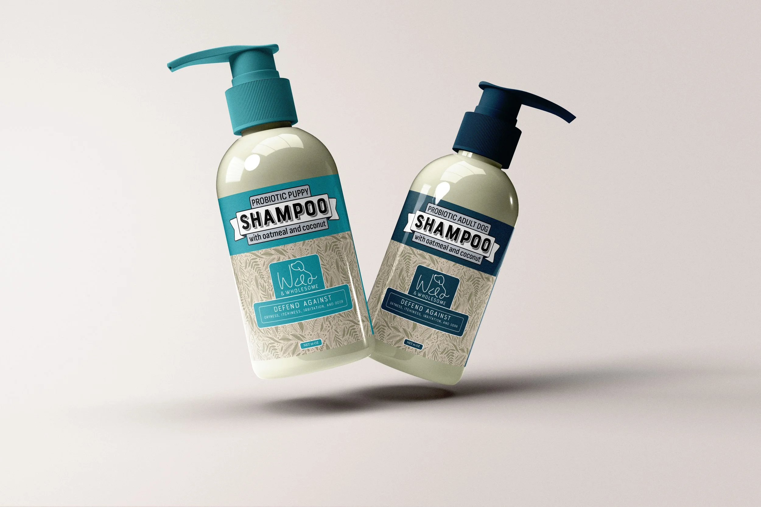
Wild & Wholesome provides high-quality, organic products that prioritize animal wellness. They focus on educating customers to make informed decisions while bridging the gap between cost efficiency and premium quality. Their branding reflects a commitment to health and a fresh, clean aesthetic.
PROBLEM:
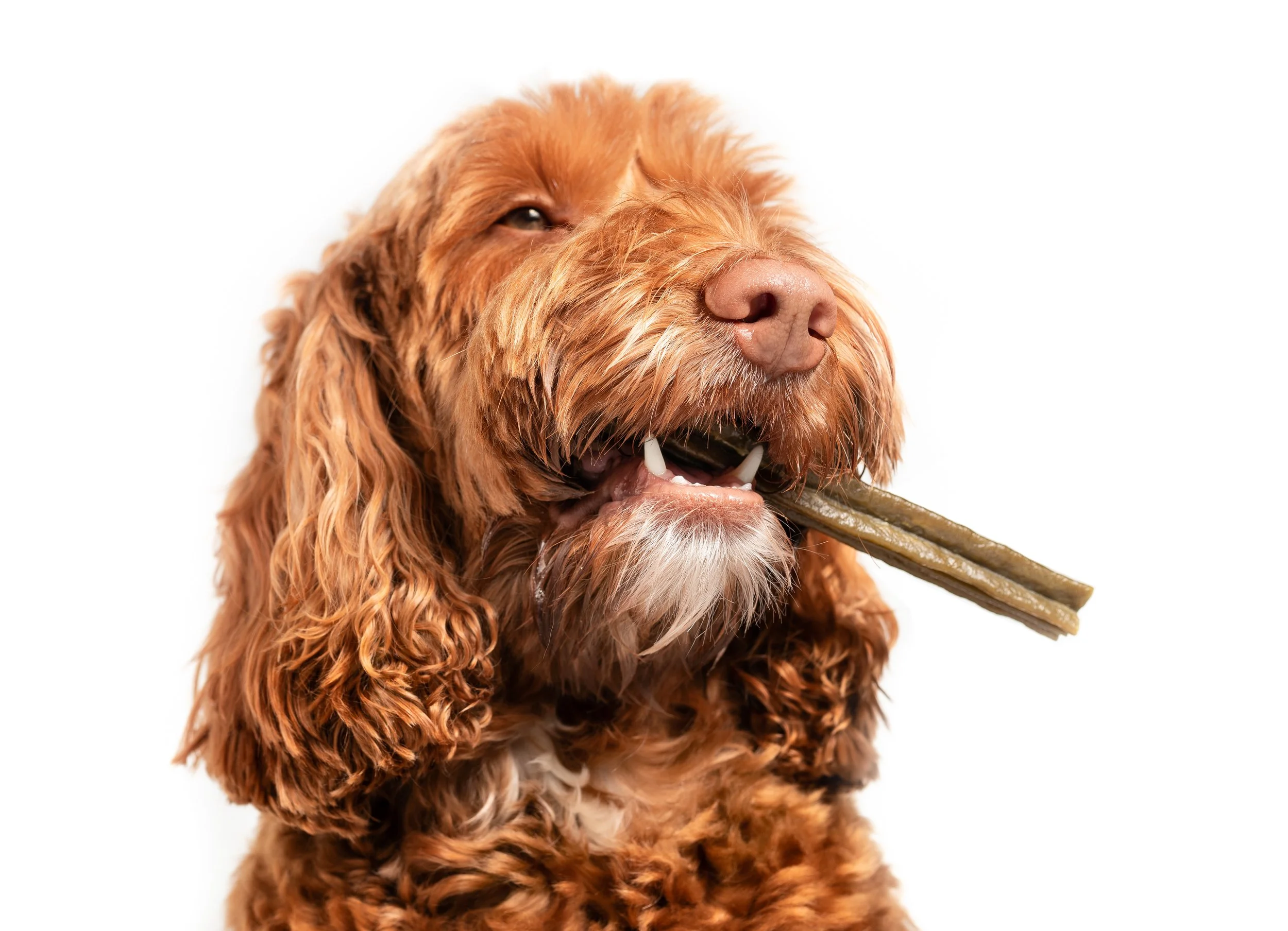
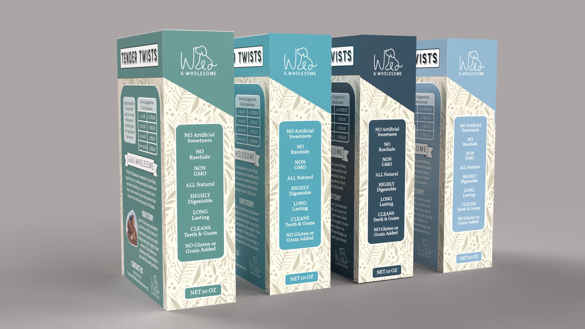
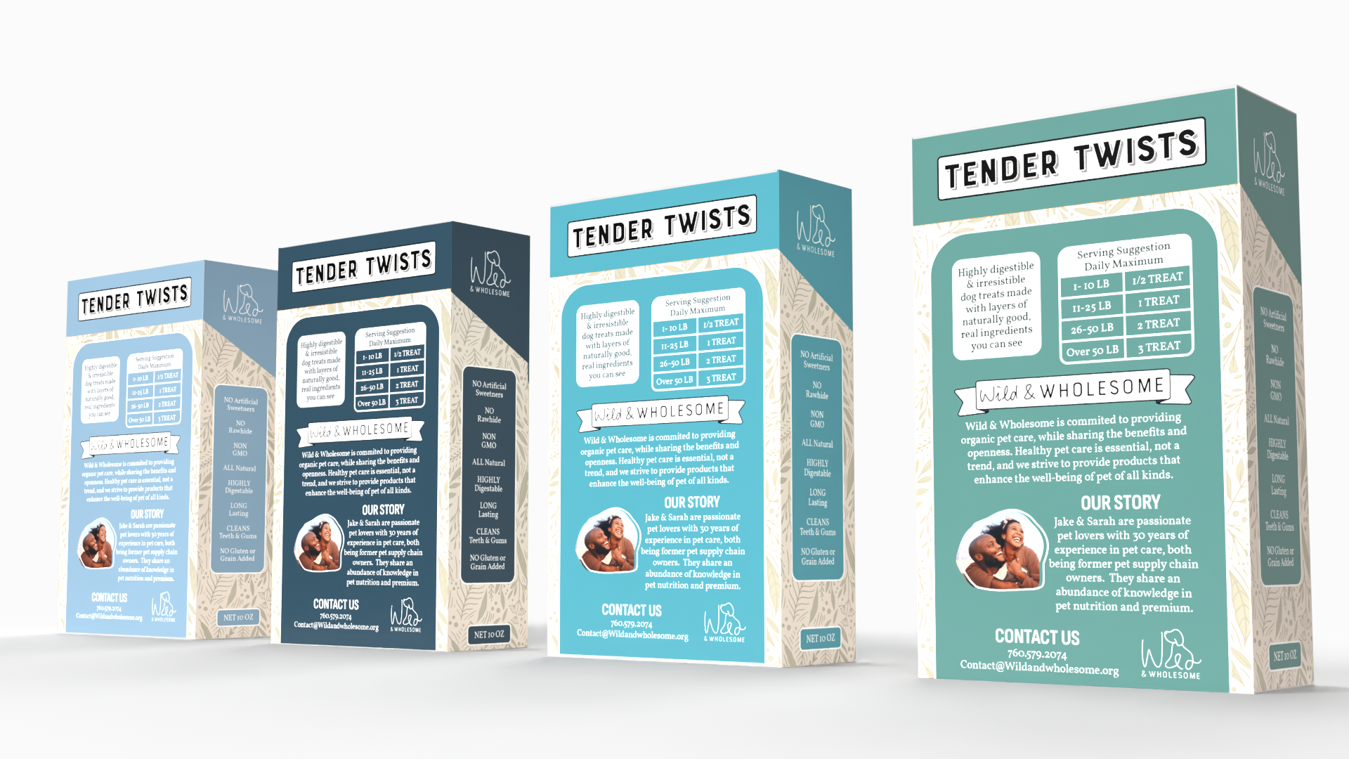
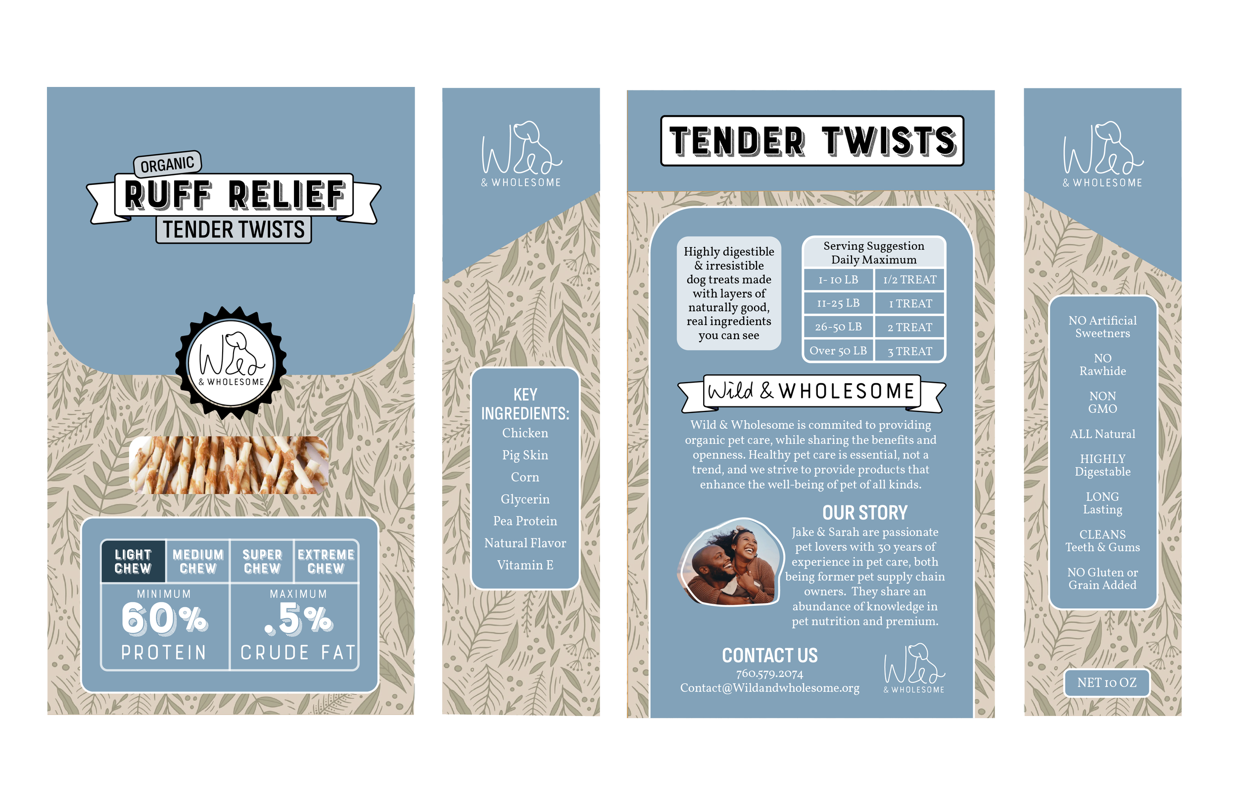
The goal was to create branding and packaging that highlights premium, organic products with a clean, fresh look. For the logo, “Wild” was emphasized for boldness while keeping “Wholesome” trustworthy. For “Tender Twists” dog treats, the cigarette-like shape led me to design packaging that blends a natural, healing vibe with a playful nod to cigarette branding.
SOLUTION:

BEGINNING STAGES
Looking through different competition and packaging from other brands is key. For marijuana and CBD packaging, there are the tags on the front that show key information, which I wanted to implement on the packaging. In addition, The dieline and style or Marlboro was inspiring for the dog treats. When it comes to competition’s animal packaging, diecuts and colors that catch the eye are important. Although, every pattern and design has a rhyme and reason related to the branding.


PROTECT YOUR DOG'S JOINTS
〰️
PROTECT YOUR DOG'S JOINTS 〰️
PROG
RESS
At the start, the focus was on creating rough sketches and layout ideas rather than color or imagery, emphasizing design intent, die-cut placement, hierarchy, logo, and potential photos. Space played a crucial role in both creation and critique, ensuring all necessary elements were included while maintaining adequate margins for printing and cohesion. Adjustments were made to the secondary font for better legibility, and hierarchy was carefully considered to prevent visual competition.


CONNECT
WITH ME

