WANDER
This project was about creating a brand identity and a well-structured site and materials plan to create an immersive and visually compelling environment. Creating a brand and clear presentation of the design elements was necessary to ensure stakeholders could fully understand the event environment.
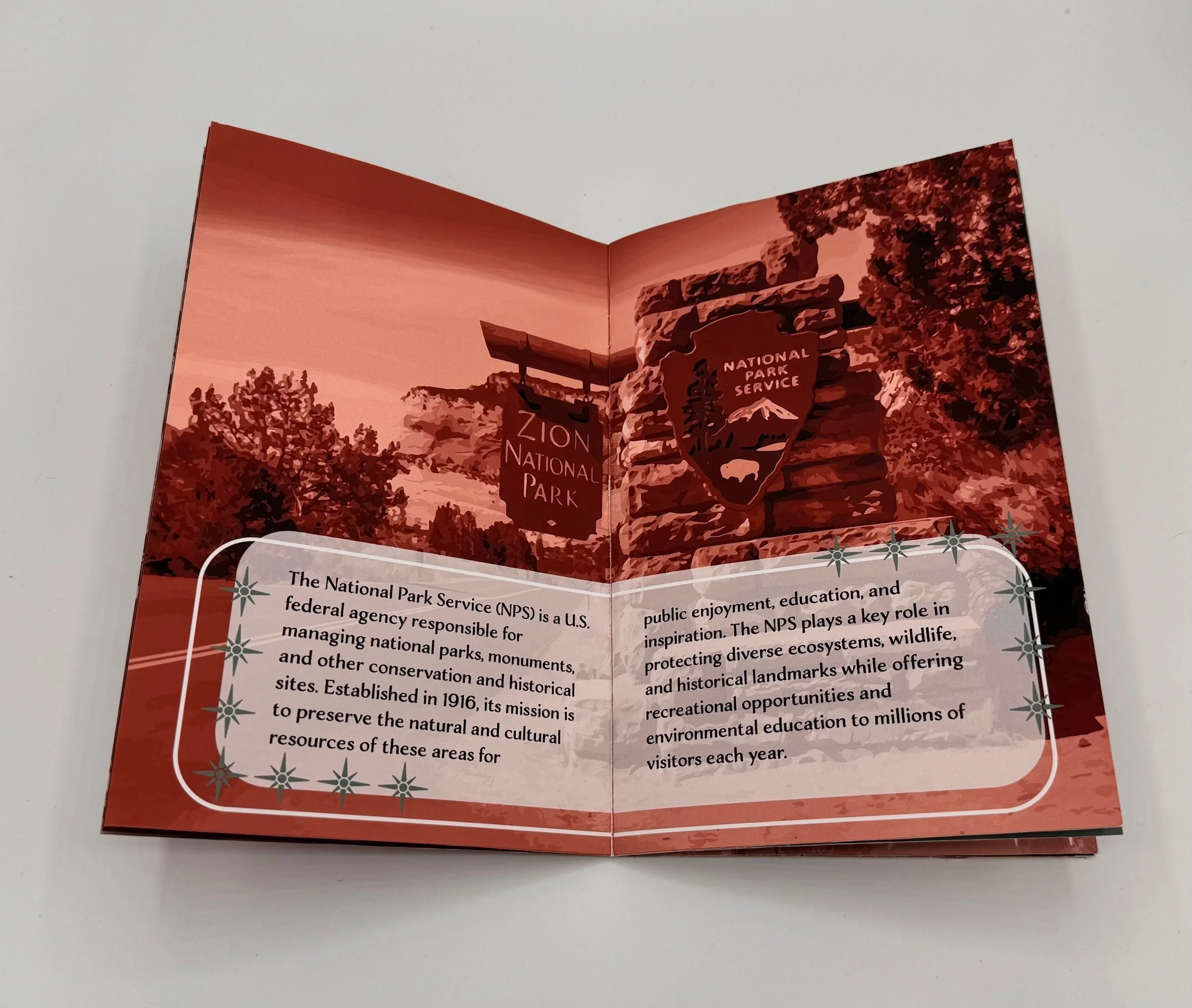
PROBLEM:
SOLUTION:
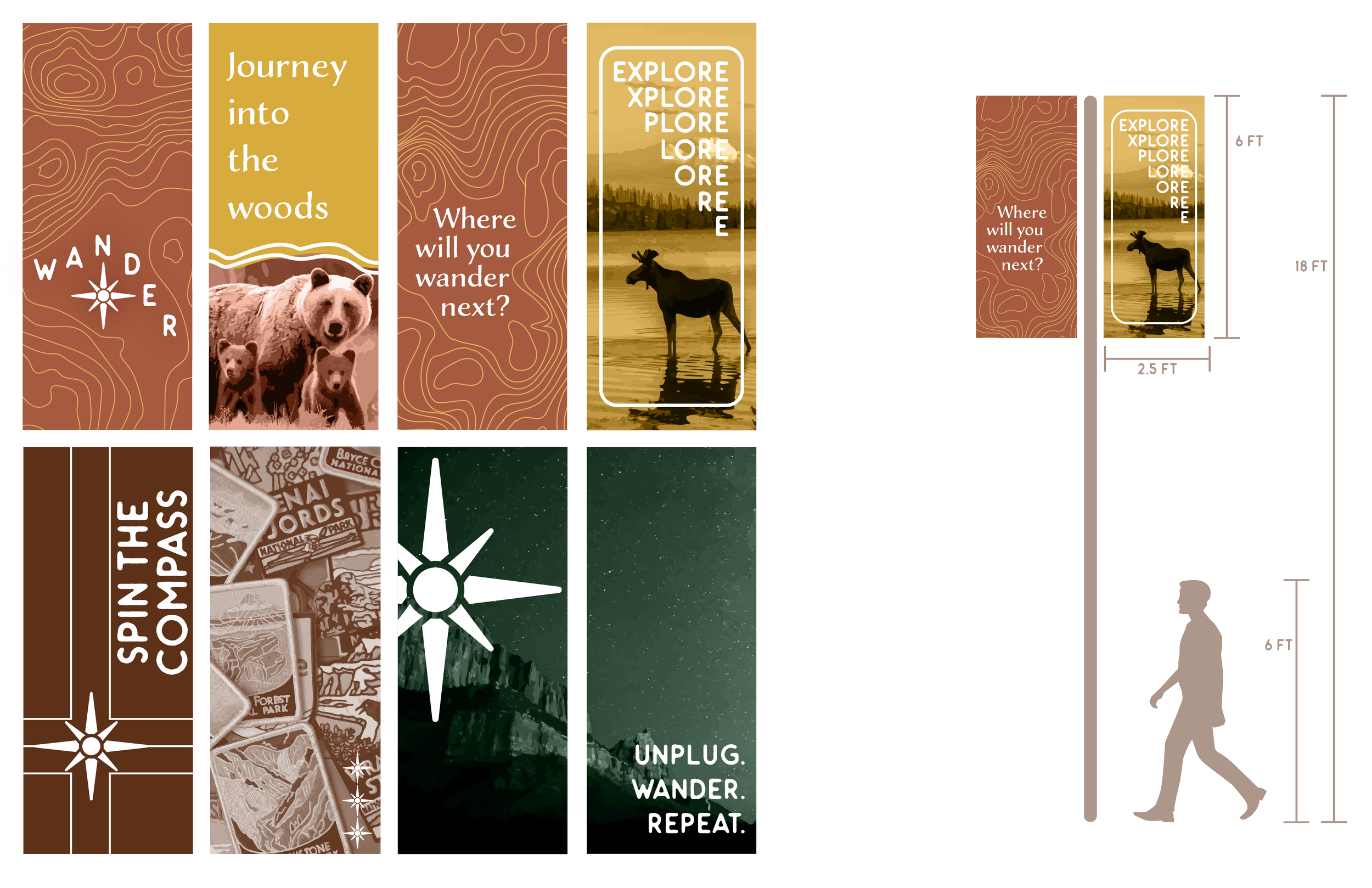
A comprehensive brand system was developed with carefully chosen design elements—color schemes, patterns, typography, and imagery—to create a distinct visual identity. Focus on materials, dimensions, and space utilization enhanced the attendee experience, delivering a cohesive and immersive event aligned with the brand’s vision.

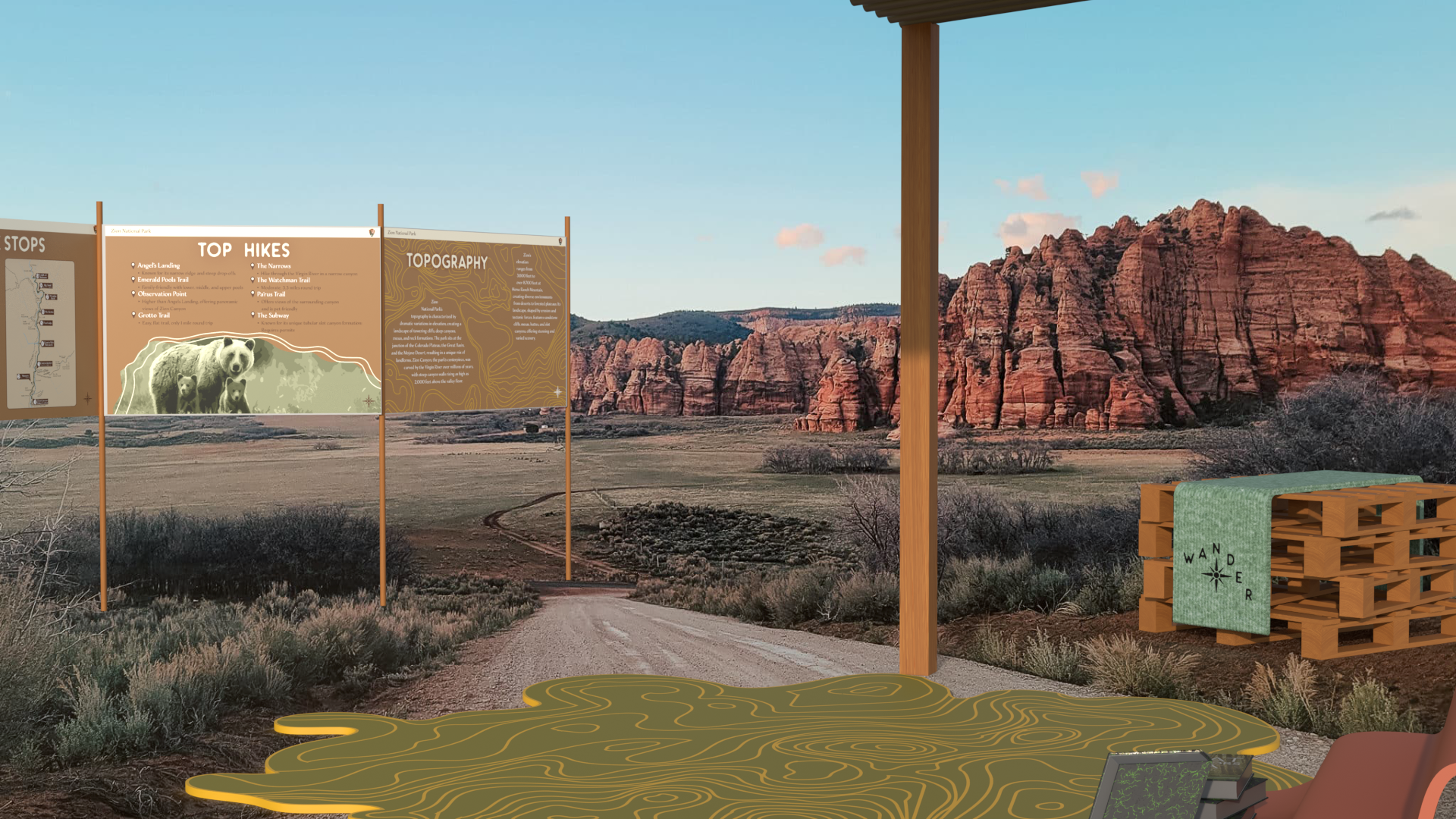
BEGINNING STAGES
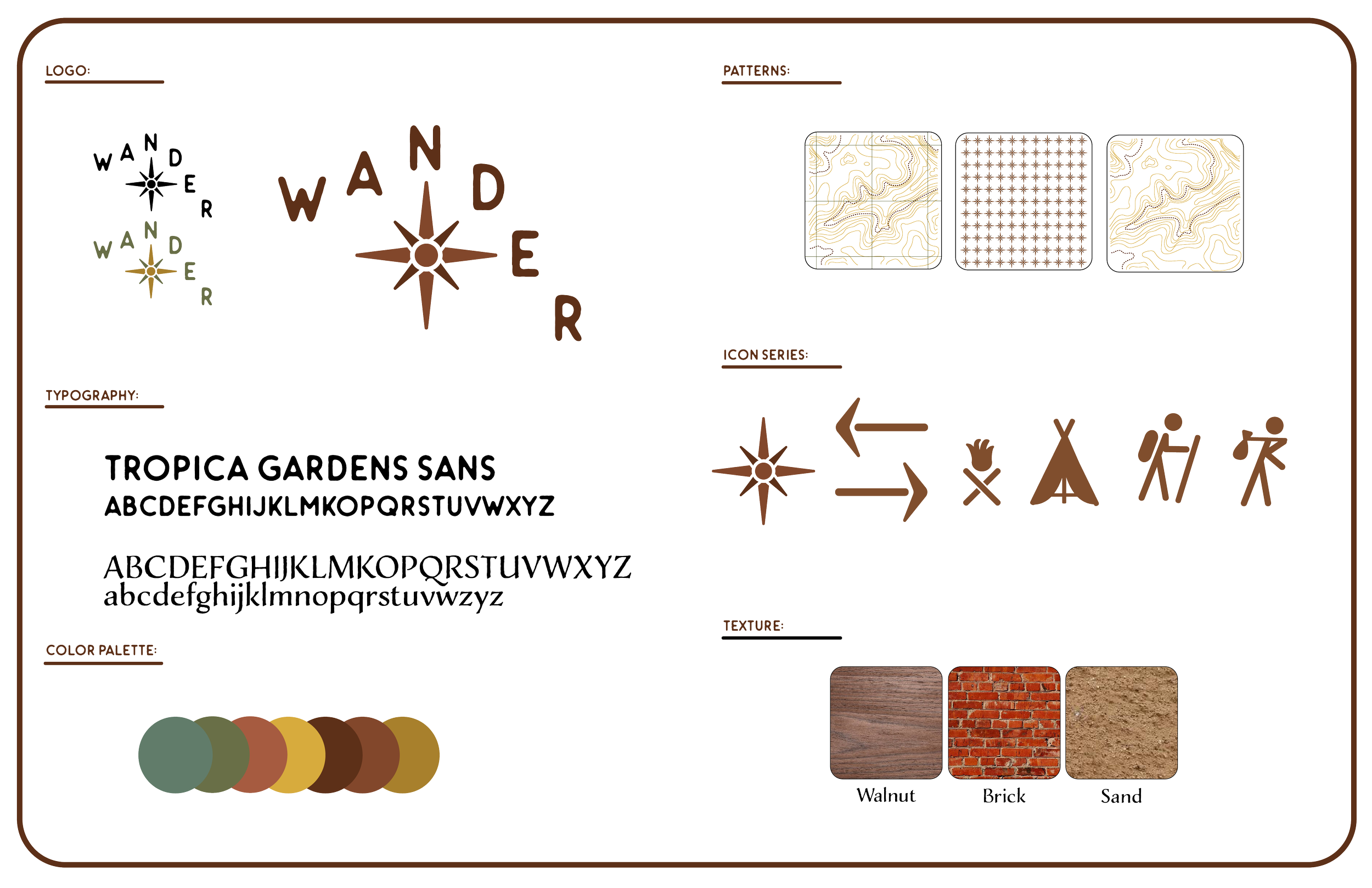
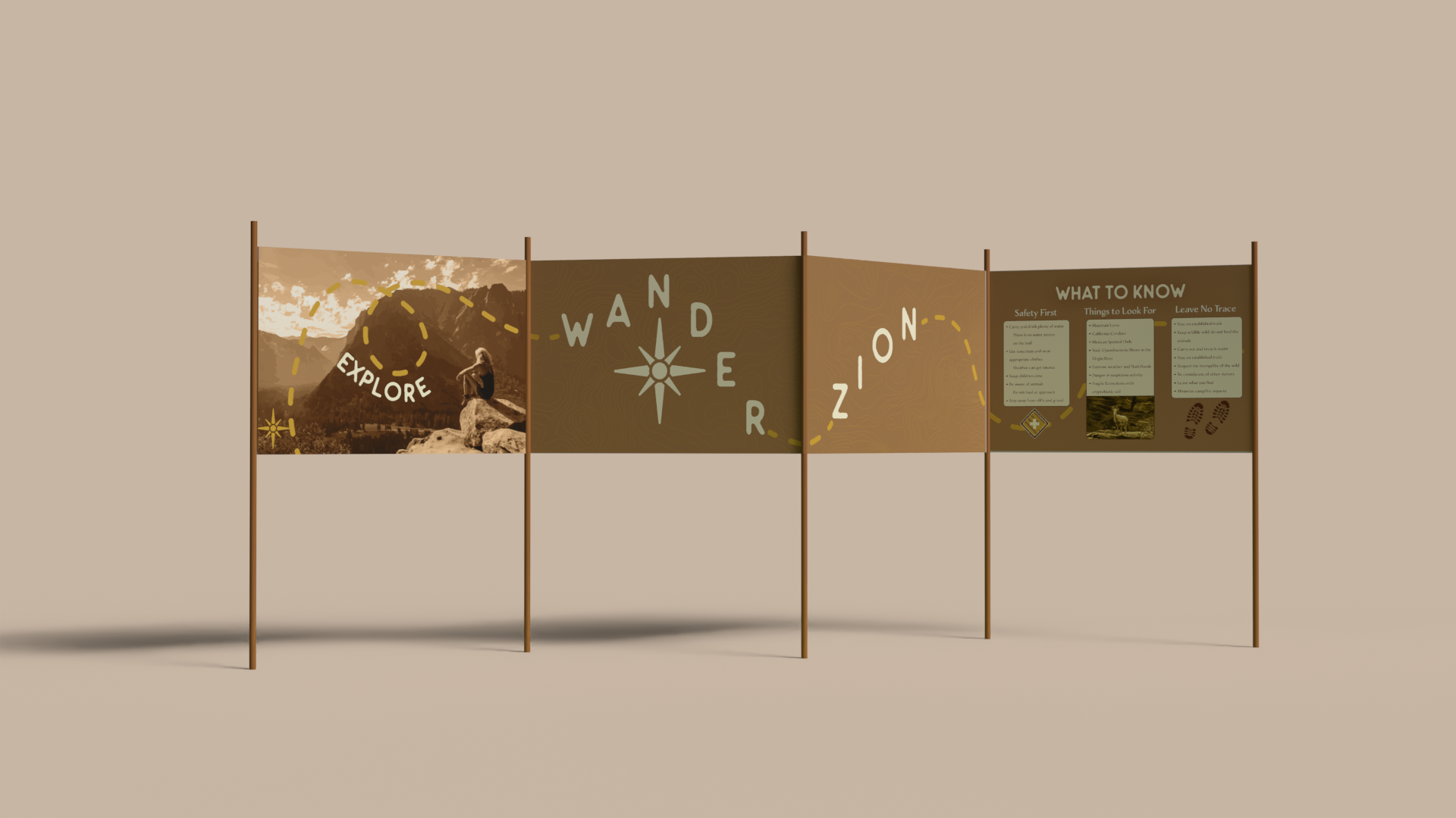
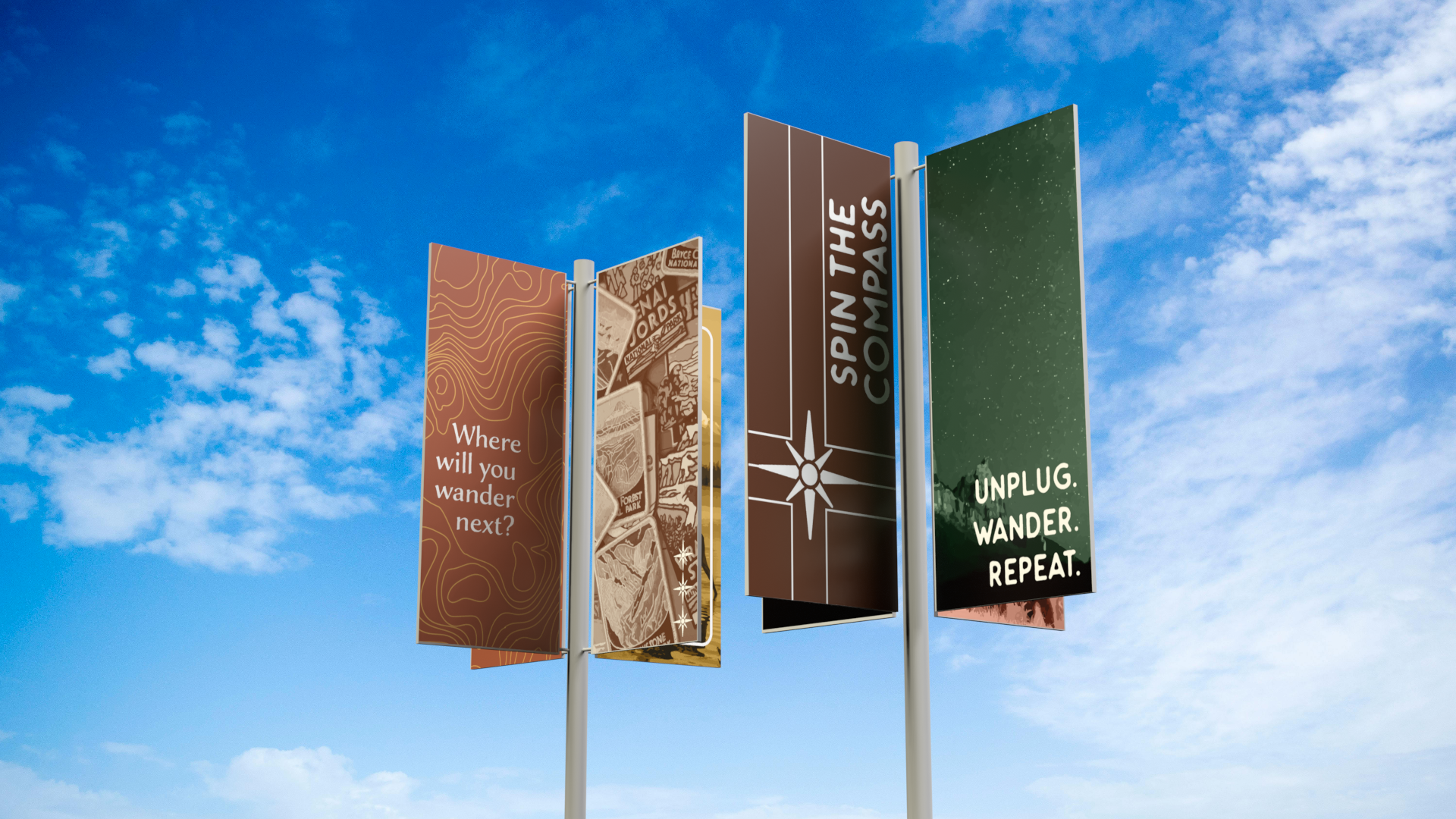
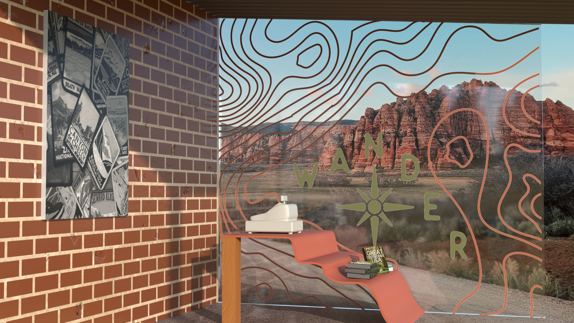
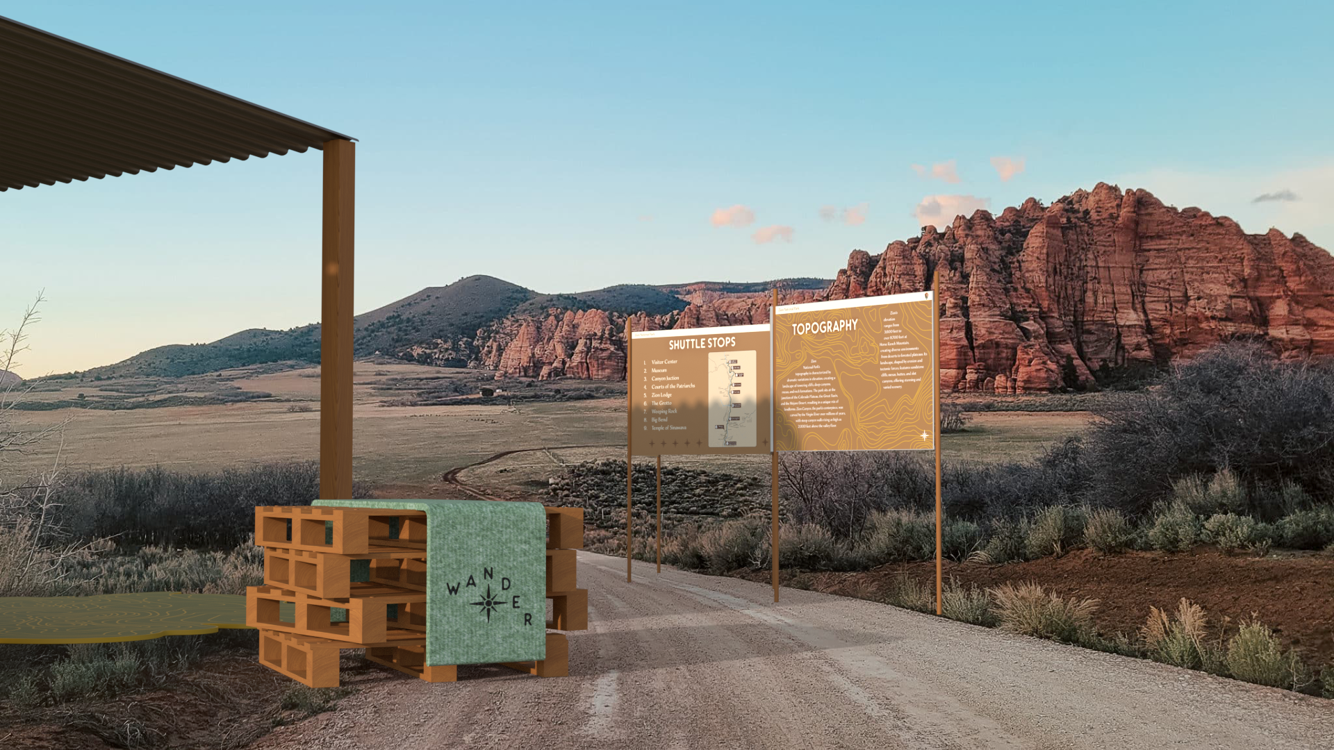
While exploring different experiential design environments and kiosks, the wooden concept kept coming up as a theme. The environment intent was to create an open, inviting space that didn’t feel confined. When developing the brand, many sketches were drawn so that it would be perfected. Having the compass, wandering of the letters, and rounded edges was very important for the final logo design.

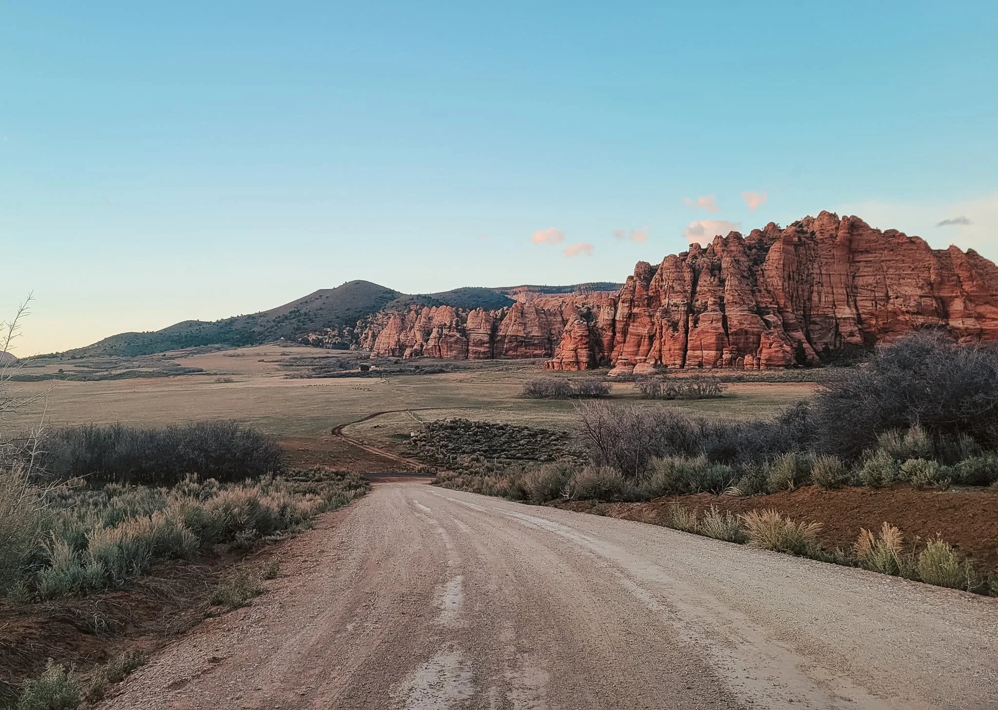
WANDERING ZION
〰️
WANDERING ZION 〰️
PROG
RESS
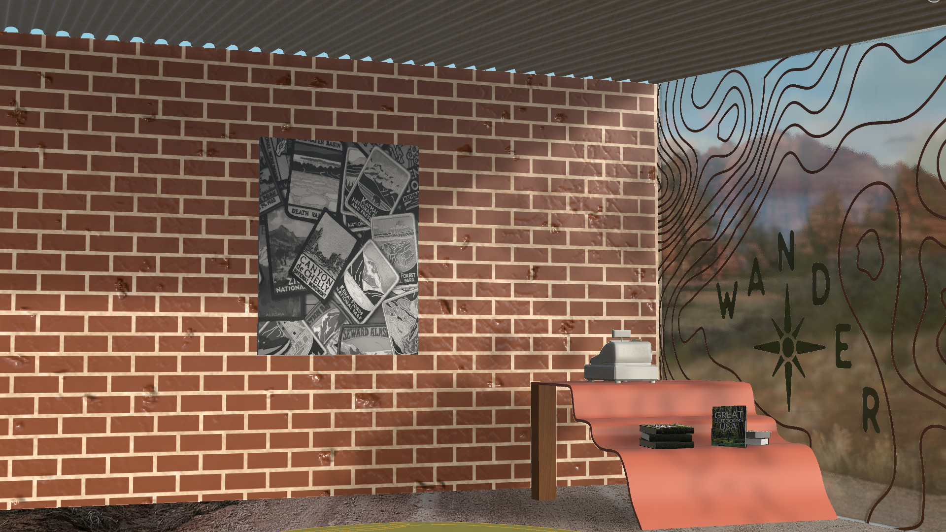
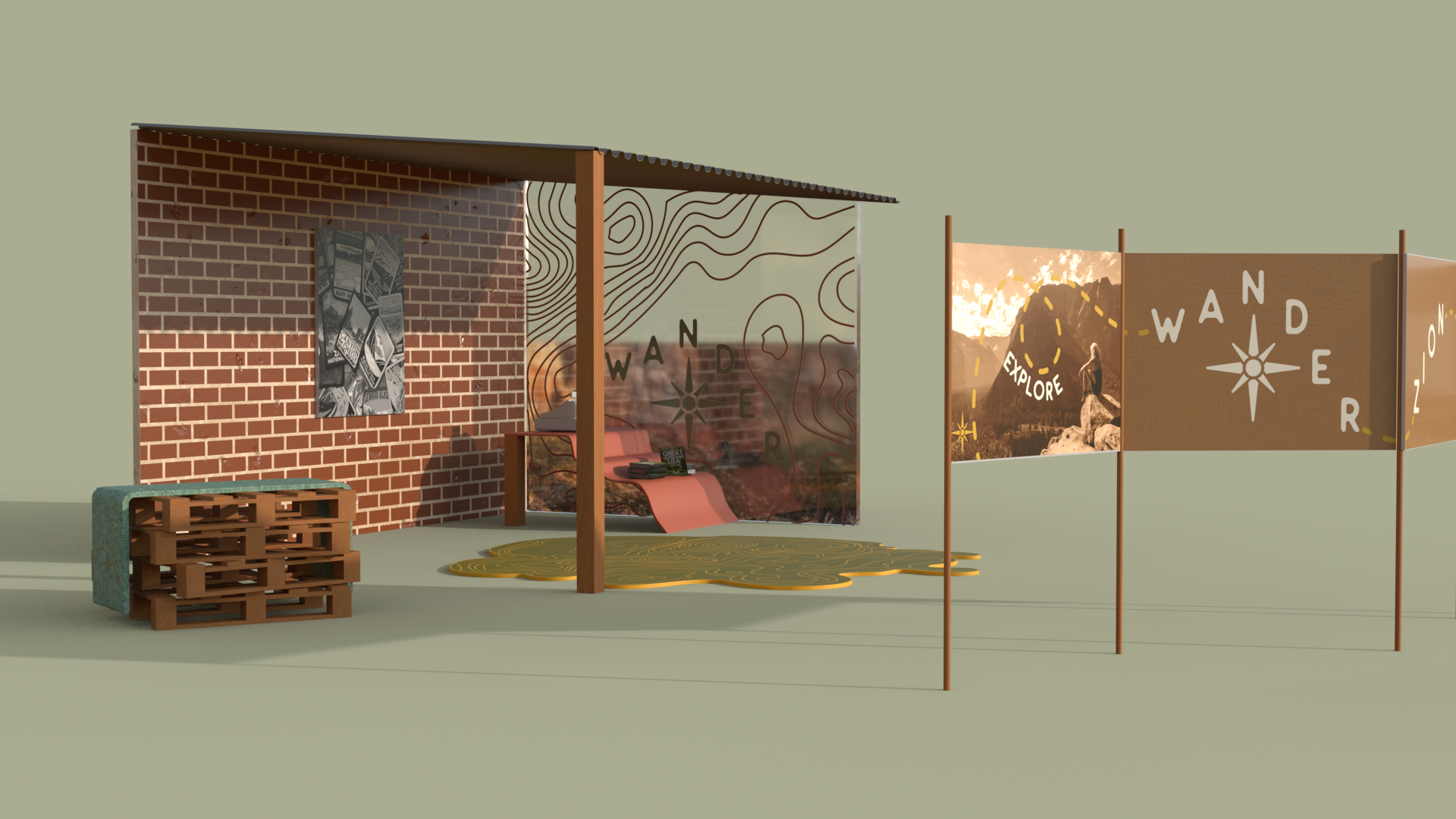
When it came to making a brand environment that is well branded and representative of the company, the environment flats are a good aid. While the brick is a material of the brand, I wanted to further show the brand on at least two surfaces, which is why a rug was added to further enhance the brand placement into the space. Kiosk flats are helpful for concept understanding, as well. When trying to explain to a client how the kiosk and environment will work, these flats are necessary. For the second, bottom kiosk, having the top down was needed so that it can be seen how the person interacts with the kiosk.

CONNECT
WITH ME

