
UI/UX
Thoughtful interfaces designed to guide and engage users
Day Trips App
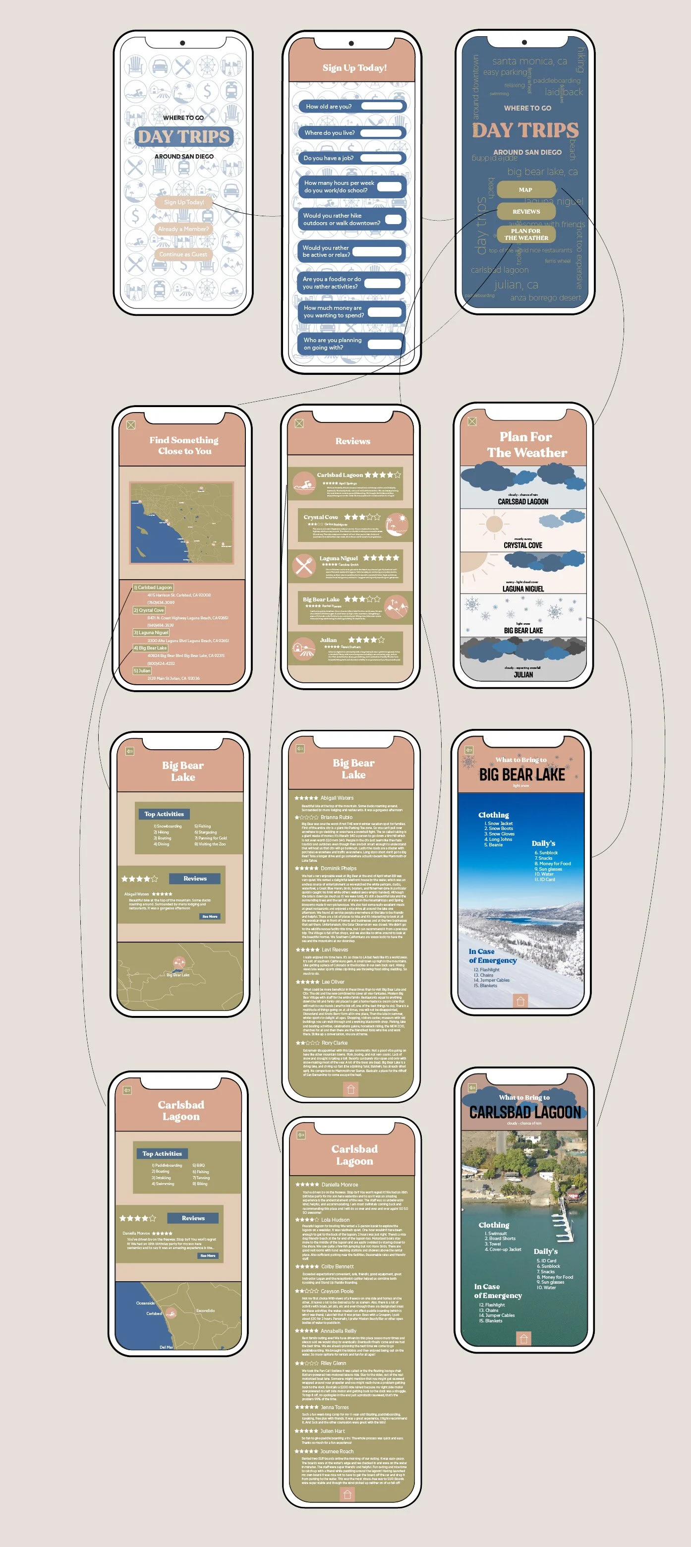
Many people in San Diego struggle to find reliable and engaging information about nearby day-trip destinations, as existing resources are often scattered, inconsistent, or not designed for an intuitive discovery experience. This project aimed to improve that experience by designing an app that centralizes information and makes exploring destinations more seamless and user-friendly through research, brainstorming, and user-focused design.

The process included developing wireframes, selecting a cohesive nature-inspired color palette, and choosing typography that reflects an adventurous and fluid aesthetic. Built in Figma, the prototype incorporates personalized user inputs such as location, budget, group size, and activity preferences to tailor recommendations. Key features include an interactive map, integrated review system, real-time weather updates, and packing suggestions, along with a flexible landing page offering sign-up, sign-in, or guest access to support different user needs.
Victory Farms Andalusians
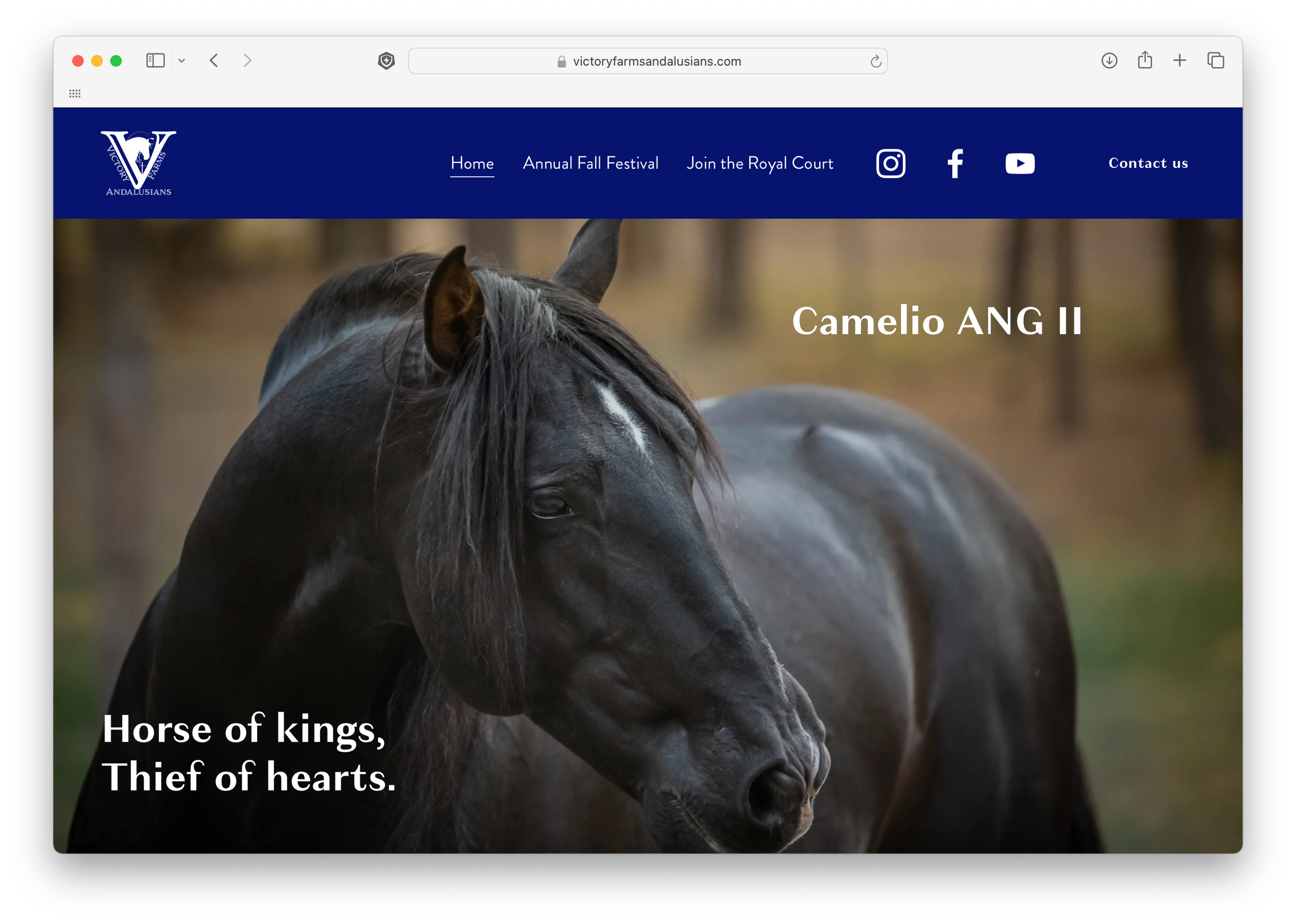
I was brought in to redesign a company website that offers a wide range of services, including fall festivals, horse photography, breeding, and partnerships with multiple brands and organizations. The original site felt overwhelming and difficult to navigate, with too much information competing across pages and a lack of clear structure for users to follow. My goal was to streamline the experience by improving hierarchy, simplifying navigation, and clarifying the overall user flow.

I reorganized and refined the content to better communicate what the company actually wants to emphasize on each page, removing unnecessary or repetitive information that added clutter. By restructuring layouts and adjusting how information is distributed across the site, the design became more focused, intuitive, and user-friendly, allowing visitors to quickly understand offerings and navigate between events and services with ease.
San Diego Saucery
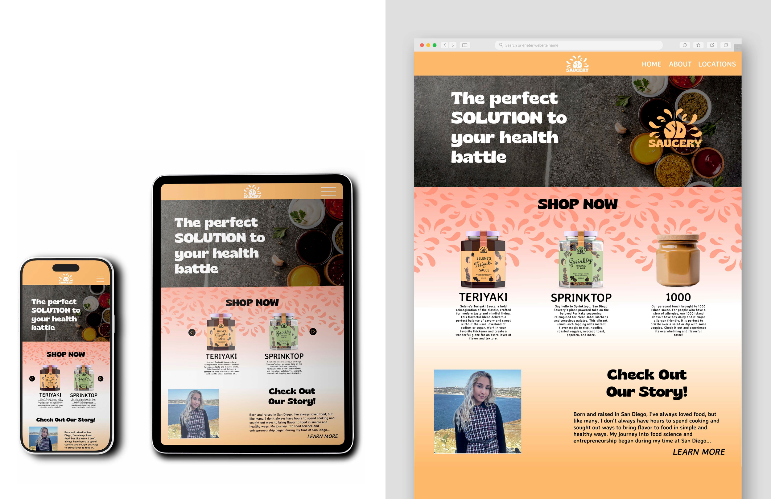
Displaying the brand in the website is beyond important. I took this opportunity to strongly connect with the packaging, displaying the variety of colors, pattern and typography. One of the things that changed was the use of photography subtly so that it stays high end. If people are coming to the website, then it typically means they want more information. I made it so there are many ways to learn from the website, having the homepage as very high overviews with many opportunities to learn fur-ther. The website was also designed to be responsive and adaptive so that it can work across any device being used.