
PRODUCT & EVENT PHOTOGRAPHY
Turning products and events into compelling visual stories
First Light Surf Club Lifestyle Shoot 1
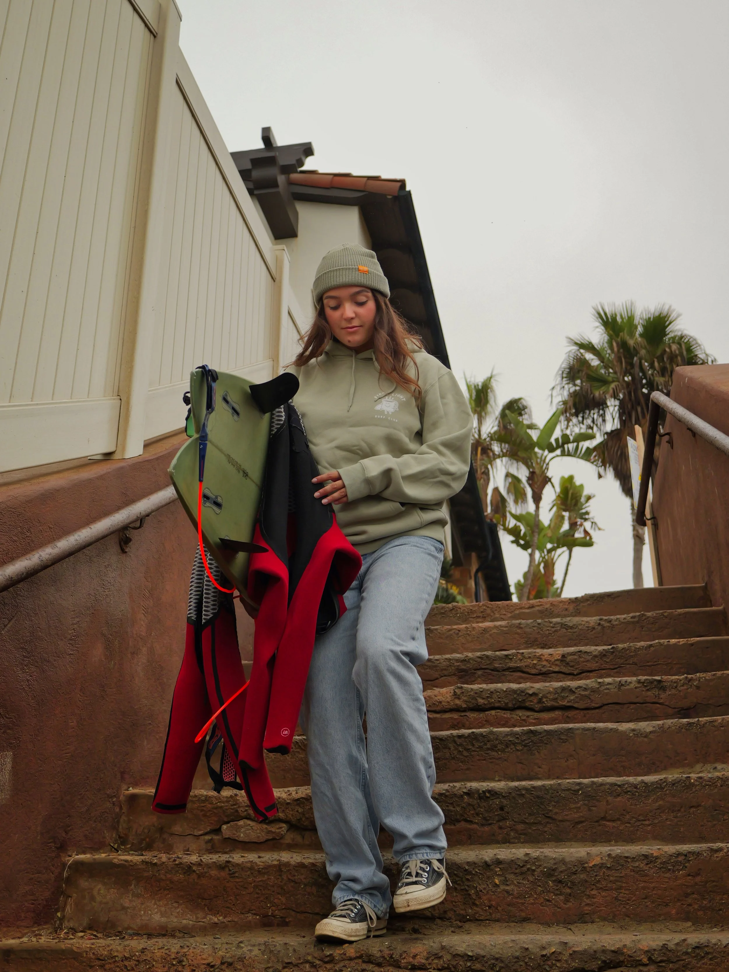
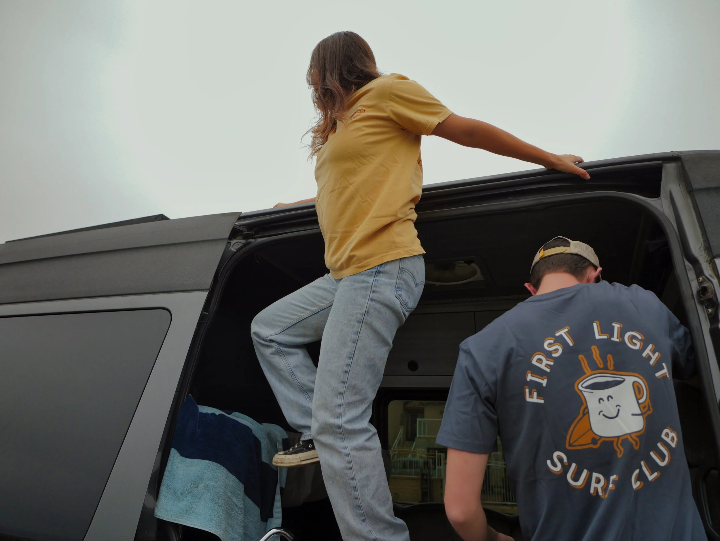
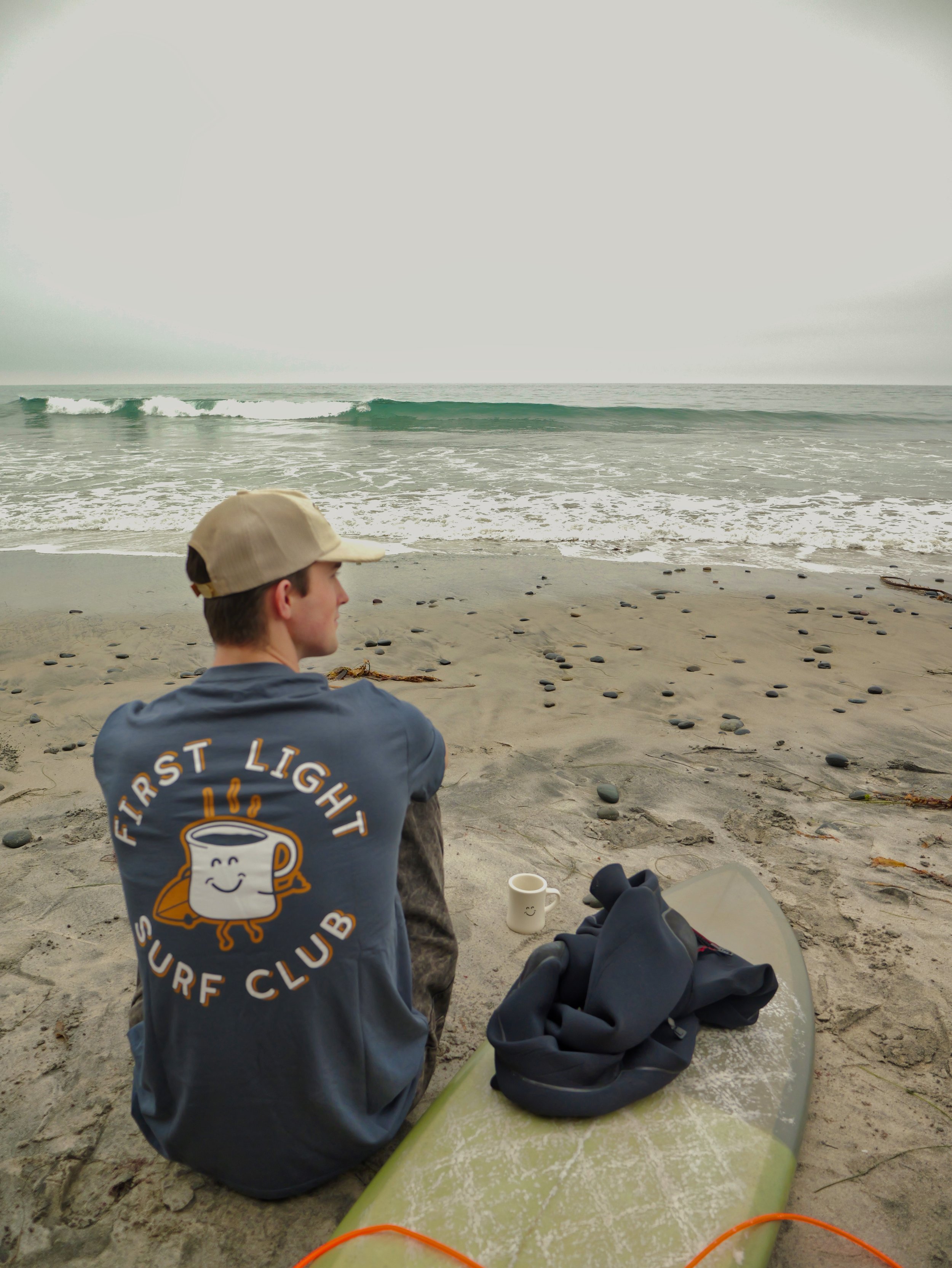
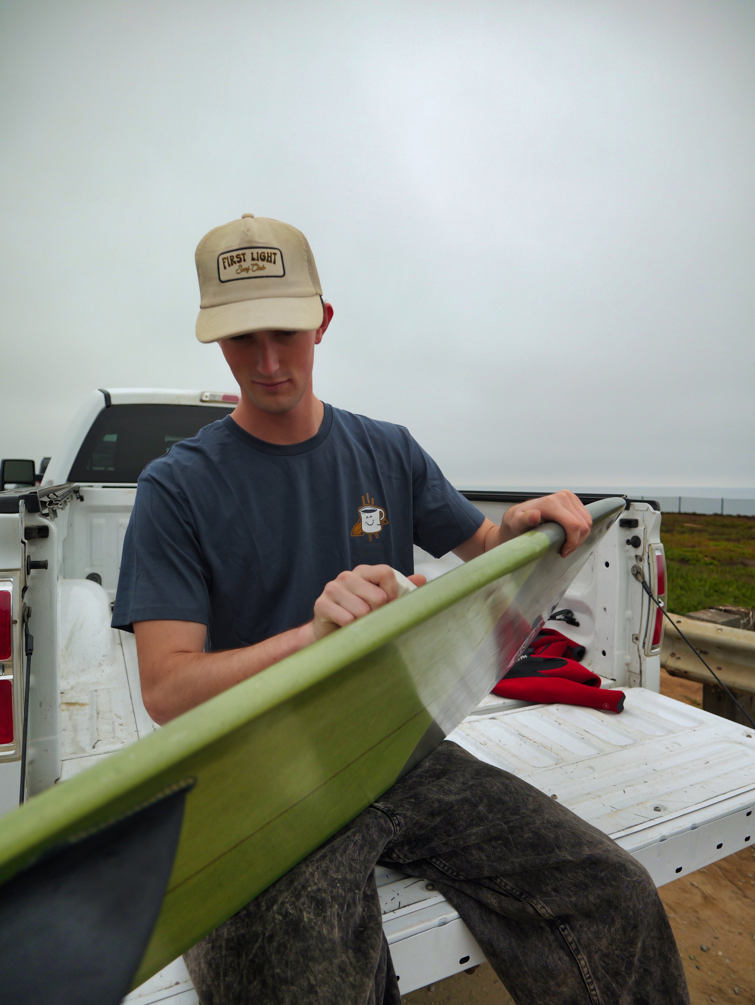
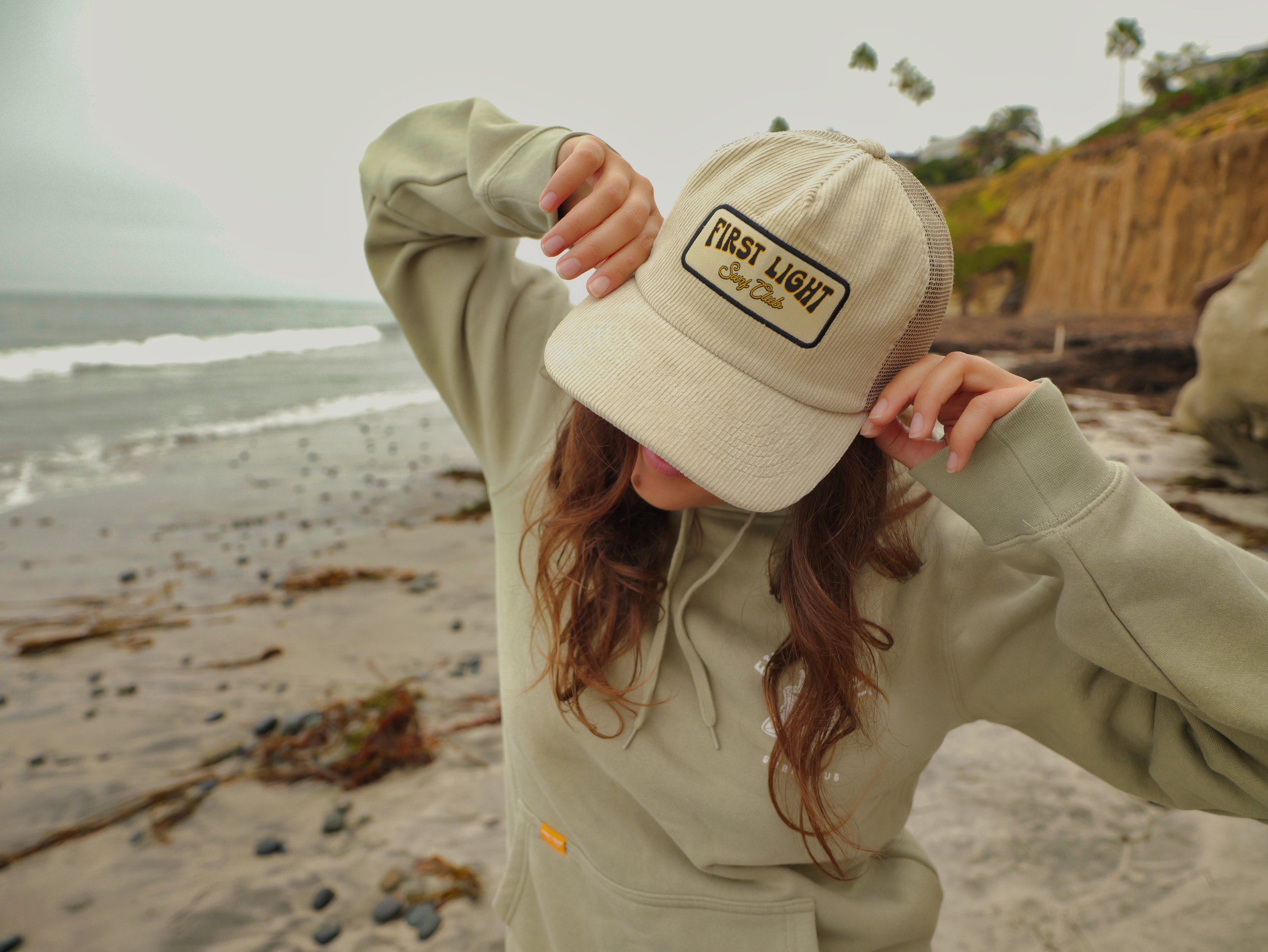
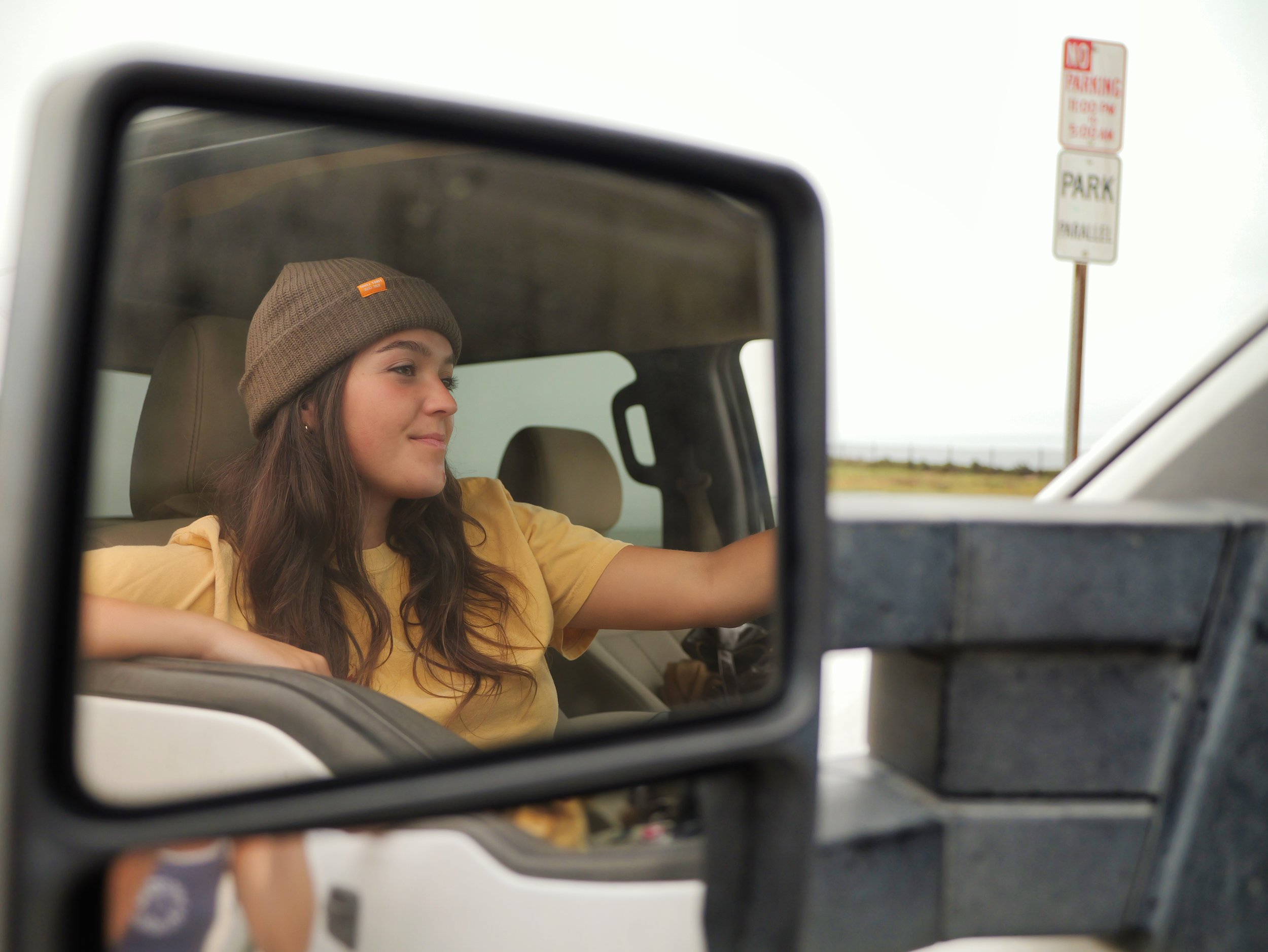
This product lifestyle photoshoot was created to showcase the brand in an authentic, experience-driven way through apparel and accessory photography featuring t-shirts and hats. Rather than relying on traditional studio imagery, the focus was placed on capturing the products naturally within the environments and activities that reflect the brand’s identity, including surfing, camping, and outdoor adventure. The imagery was styled to feel genuine, relaxed, and immersive while still highlighting product details, fit, and overall aesthetic.

The final photography was designed for both website and social media use, creating versatile visual content that strengthens the brand’s storytelling across digital platforms. By blending lifestyle moments with product-focused imagery, the shoot helps consumers visualize the products in real-world use while reinforcing the brand’s adventurous and outdoors-oriented atmosphere.
First Light Surf Club Lifestyle Shoot 2

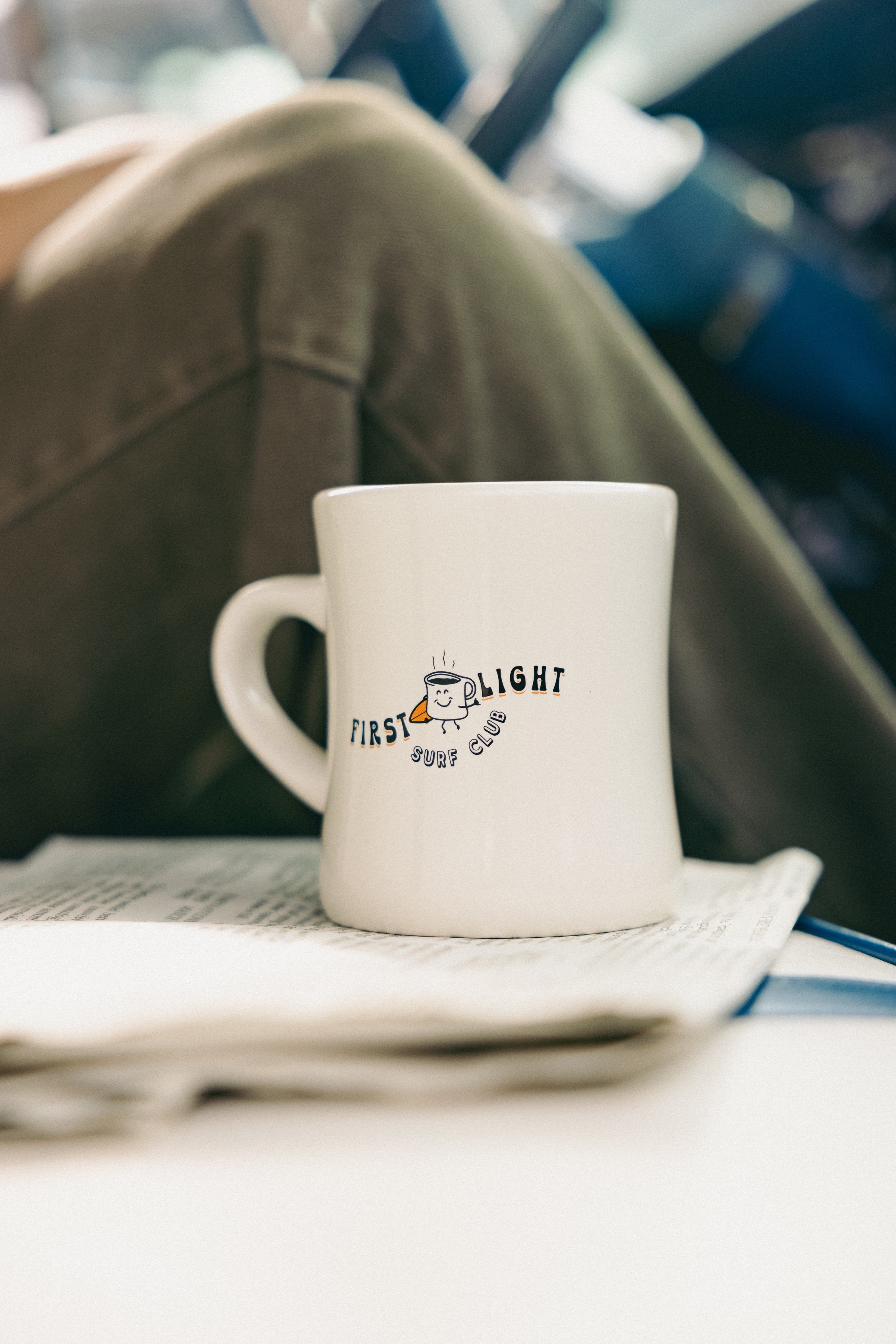
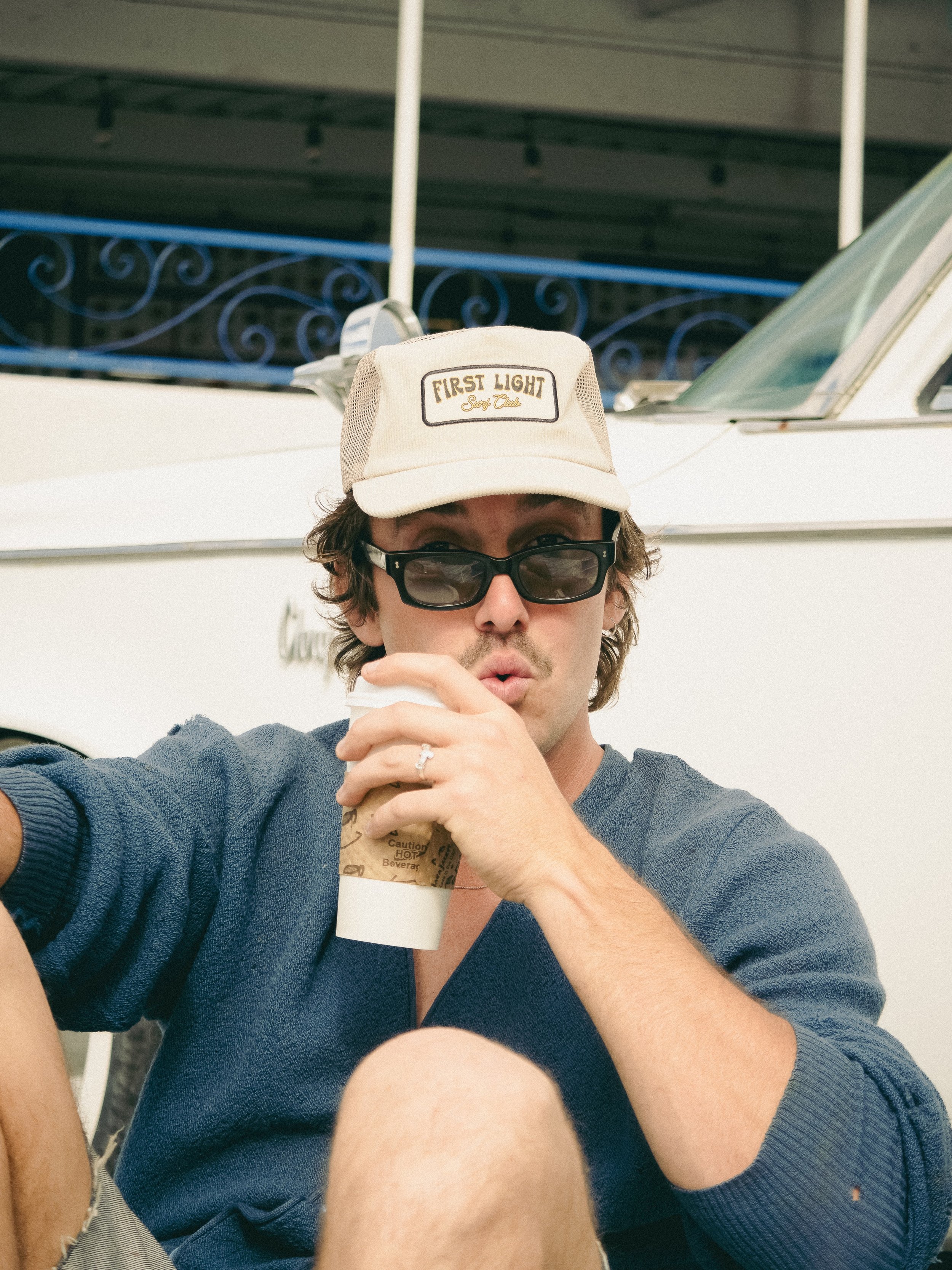
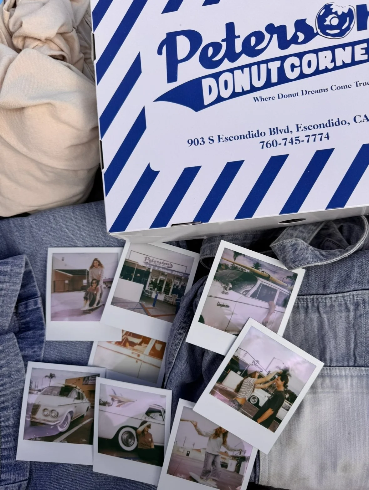
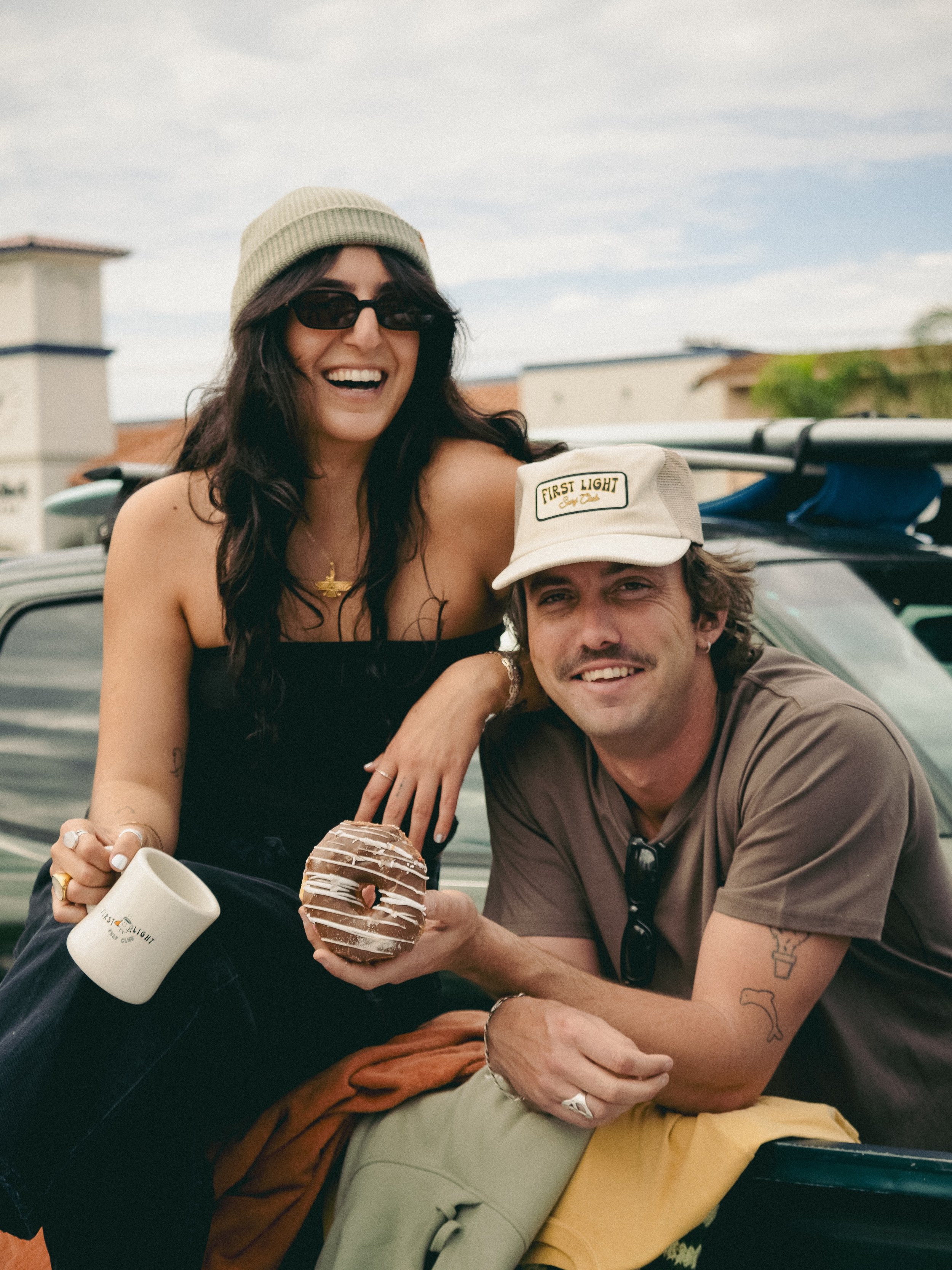

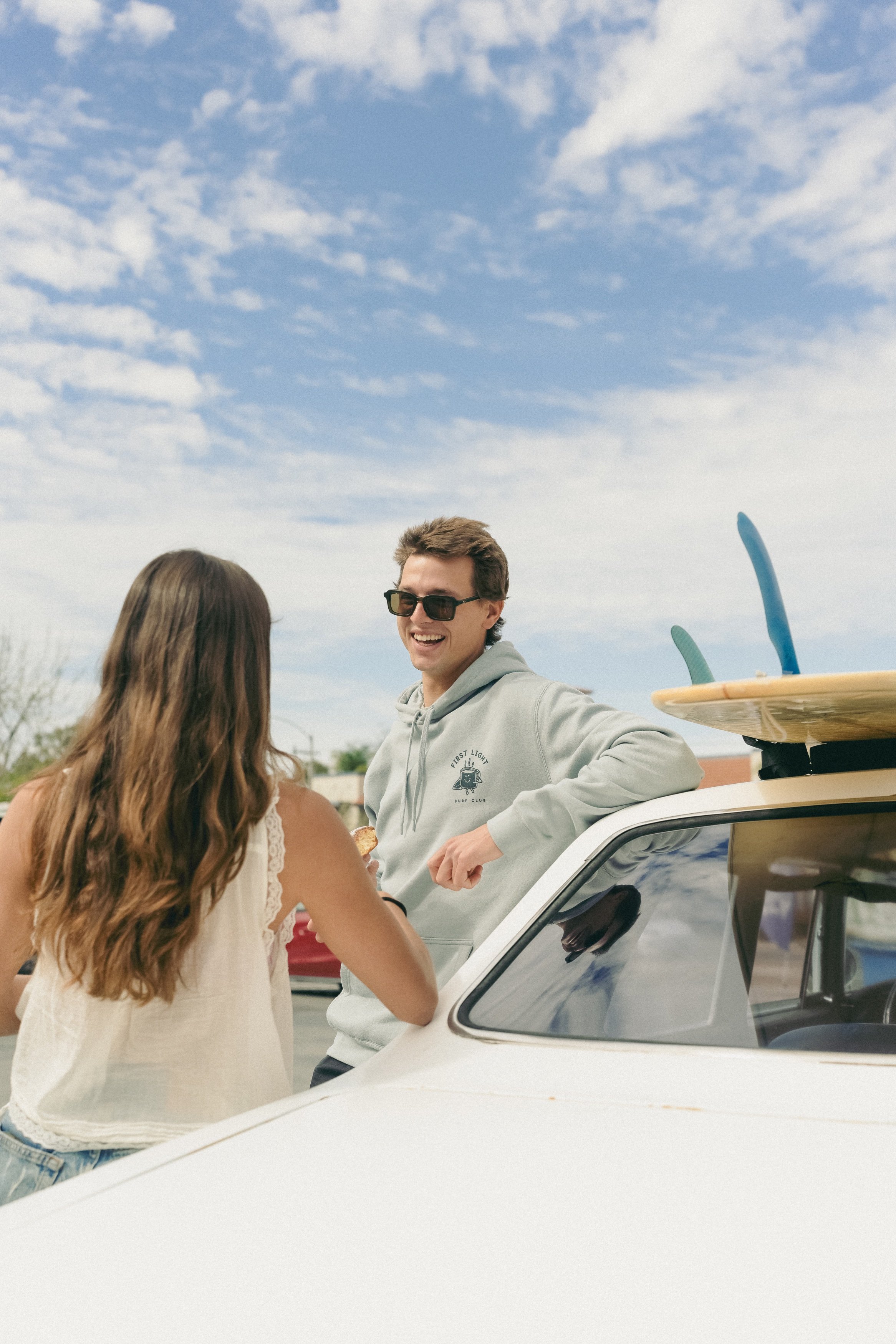
This lifestyle campaign for a surf brand was designed to capture the nostalgic and carefree atmosphere surrounding surf culture. Inspired by an older, film-like aesthetic, the shoot followed a group of friends sharing donuts before heading out to surf, emphasizing authentic connection, spontaneity, and the lifestyle behind the brand rather than solely focusing on the products themselves. The visual direction leaned into candid moments, natural movement, and environmental storytelling to create content that felt timeless, relatable, and immersive.

Created primarily for social media and digital storytelling, the campaign allowed for greater creative liberty through cinematic video clips, lifestyle photography, and personality-driven content that reflected the brand’s identity and community. By documenting genuine interactions and experiences tied to surf culture, the project strengthened the emotional connection between the audience and the brand while creating visually engaging content tailored for modern social platforms.
Barela Wedding
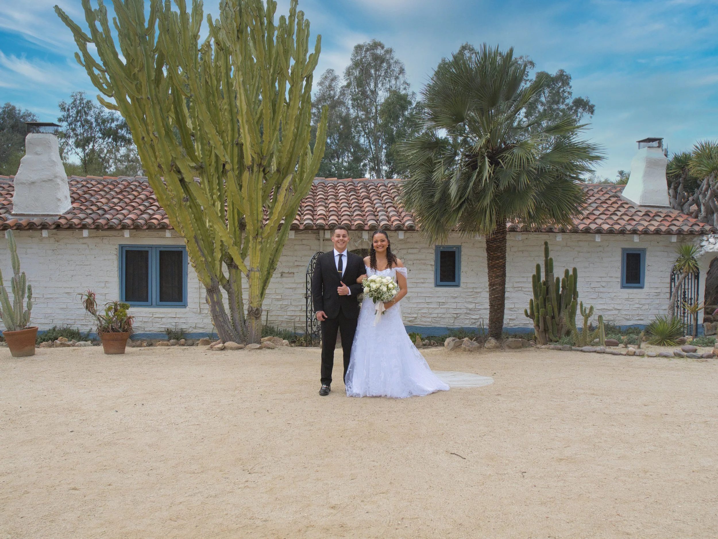
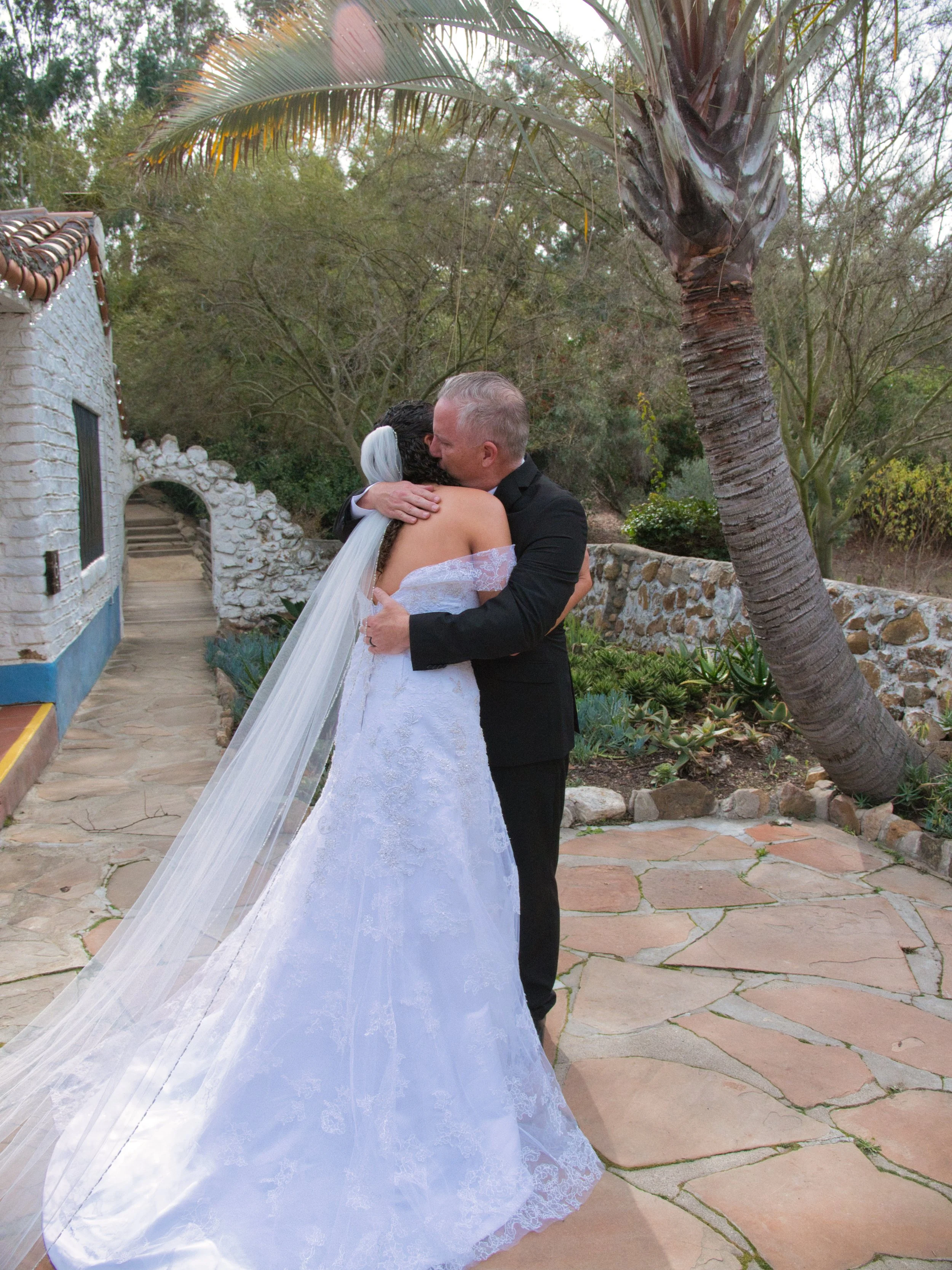
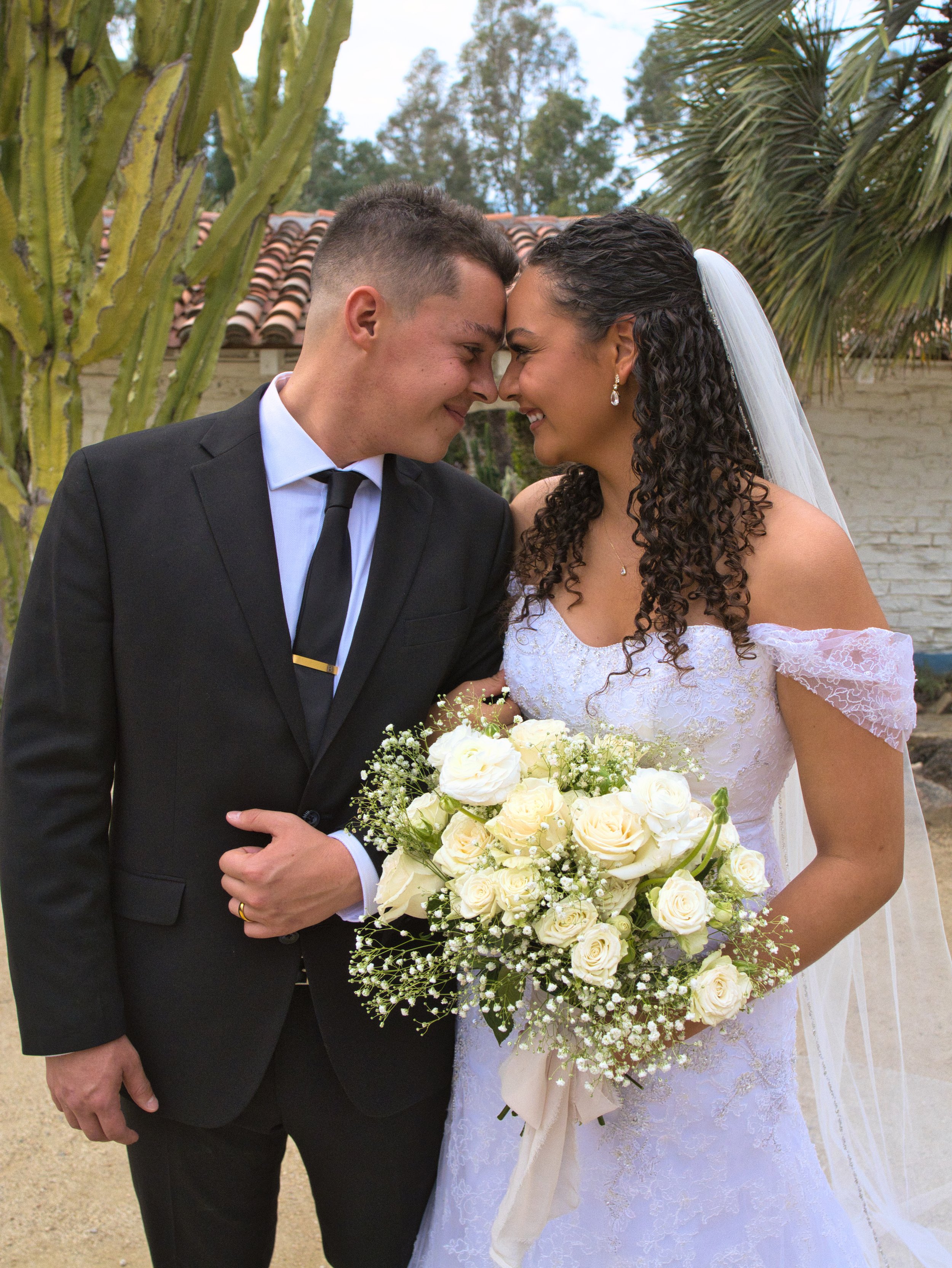
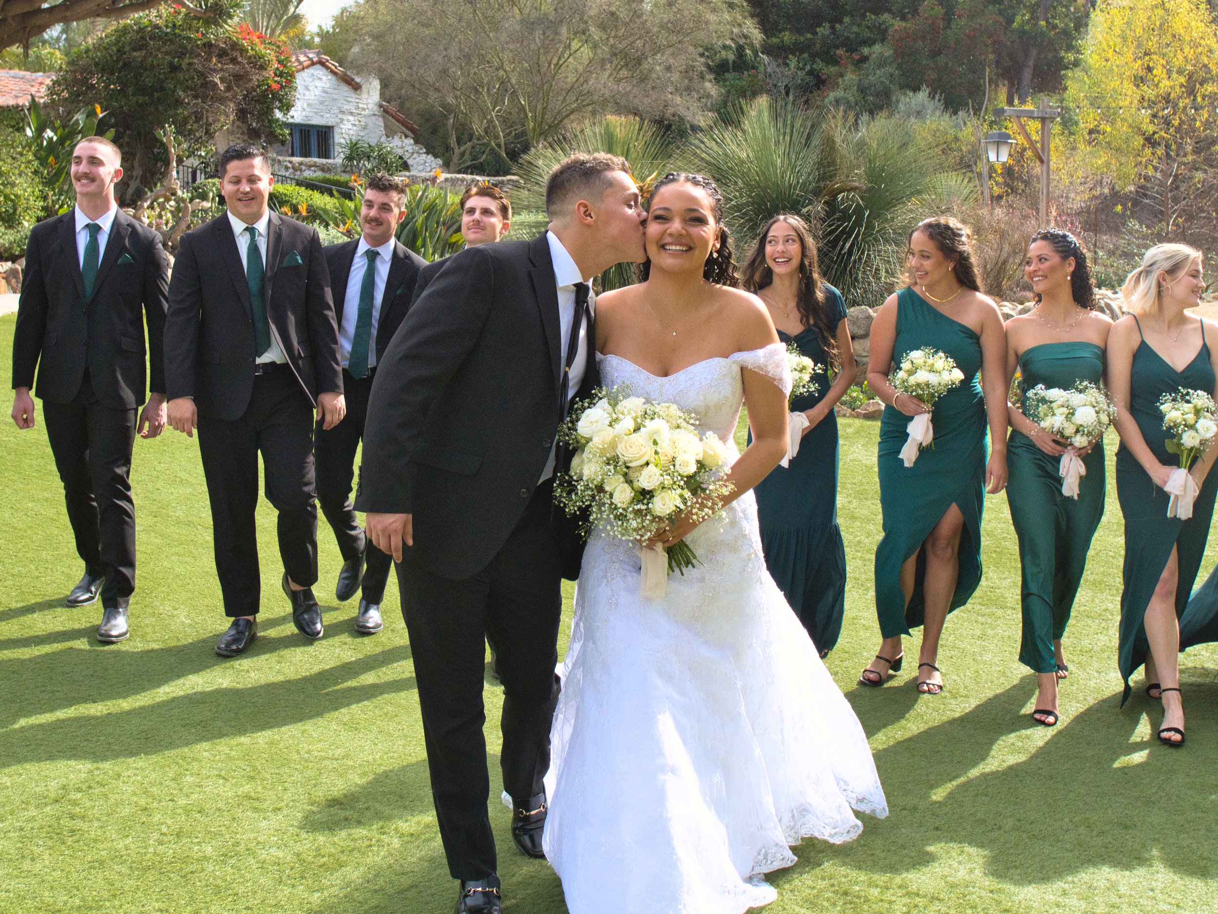
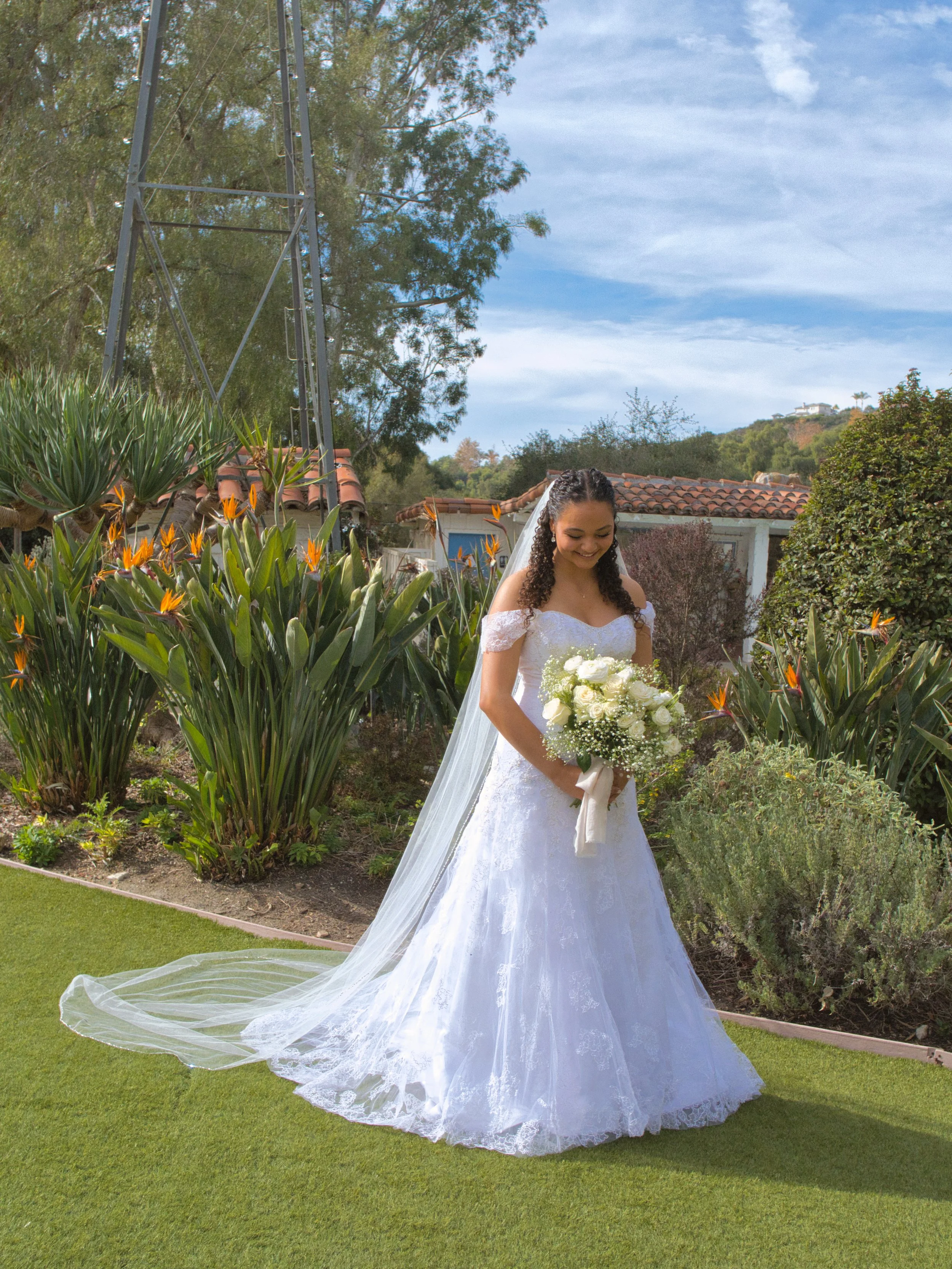
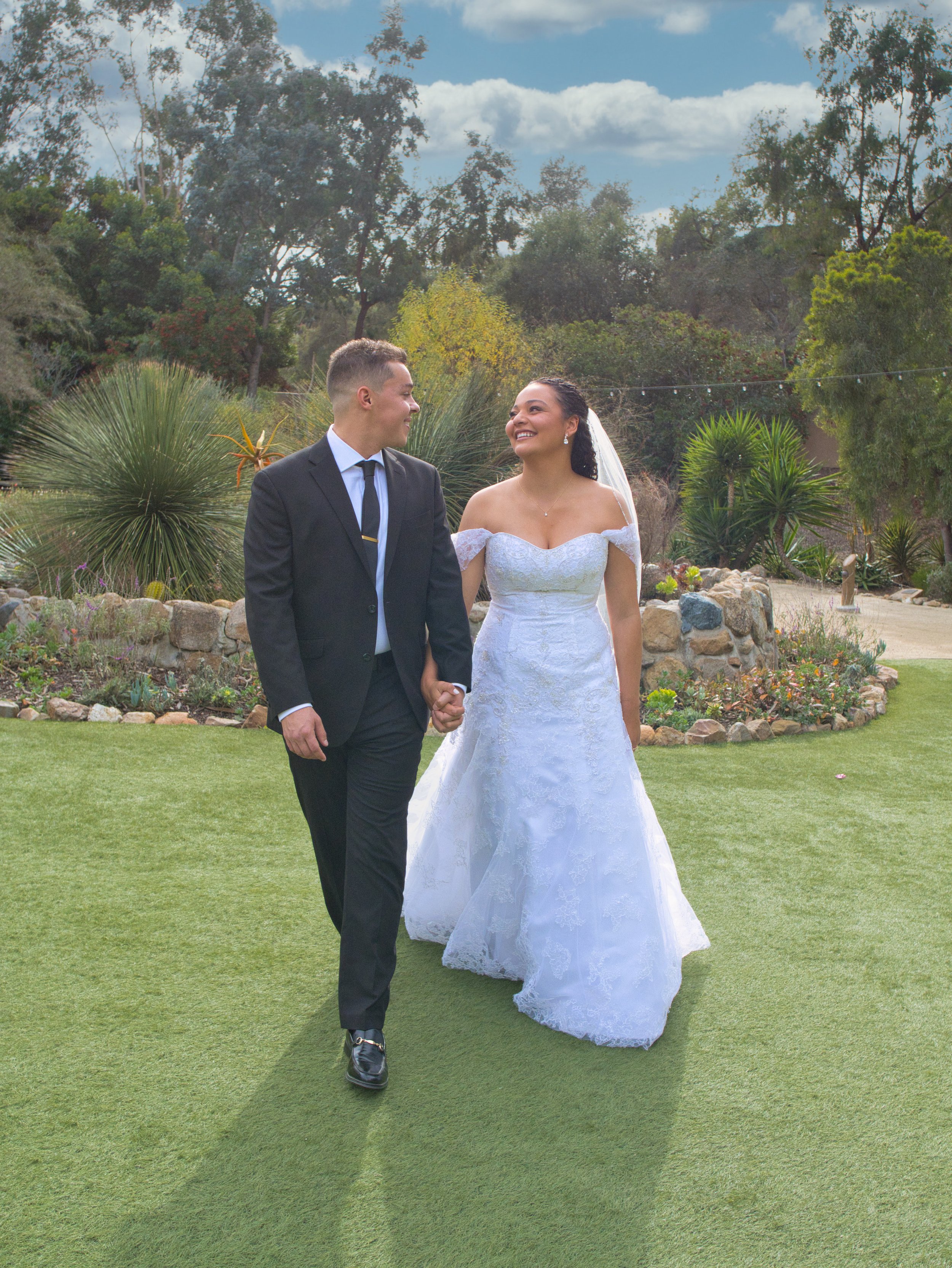
This wedding photoshoot was thoughtfully planned to create a timeless and intimate visual experience centered around the couple and their relationship. Rather than photographing solely at the ceremony venue, an offsite location was carefully selected and coordinated at an old ranch to provide a more distinctive atmosphere with natural textures, open landscapes, and rustic character. Every aspect of the shoot, from location planning to visual direction, was intentionally organized to complement the couple’s style while creating imagery that felt authentic, cinematic, and emotionally driven.

The photography focused on capturing both posed portraits and genuine in-between moments, allowing the couple’s connection and personality to naturally guide the session. By combining intentional composition, environmental storytelling, and a carefully chosen setting, the final images created a romantic and nostalgic visual narrative designed to preserve the emotion and experience of the day in a meaningful and visually compelling way.
Plant With Purpose Gala
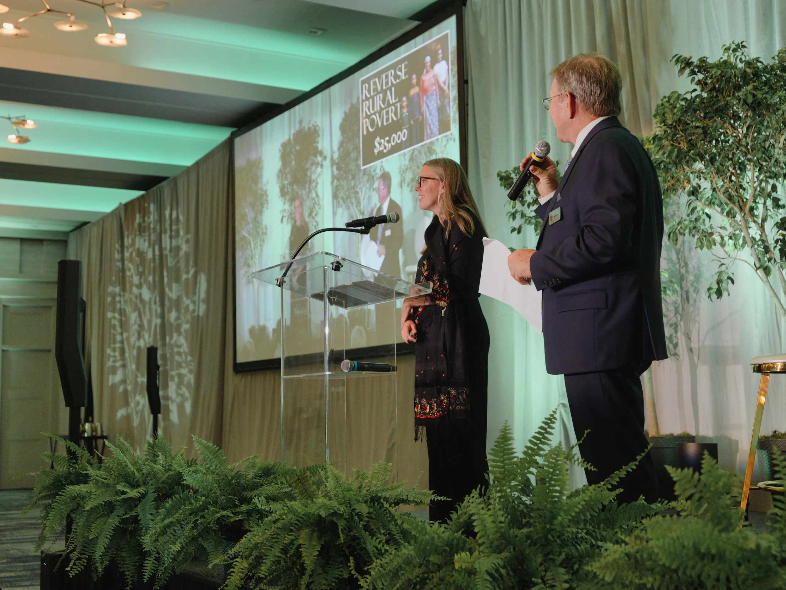
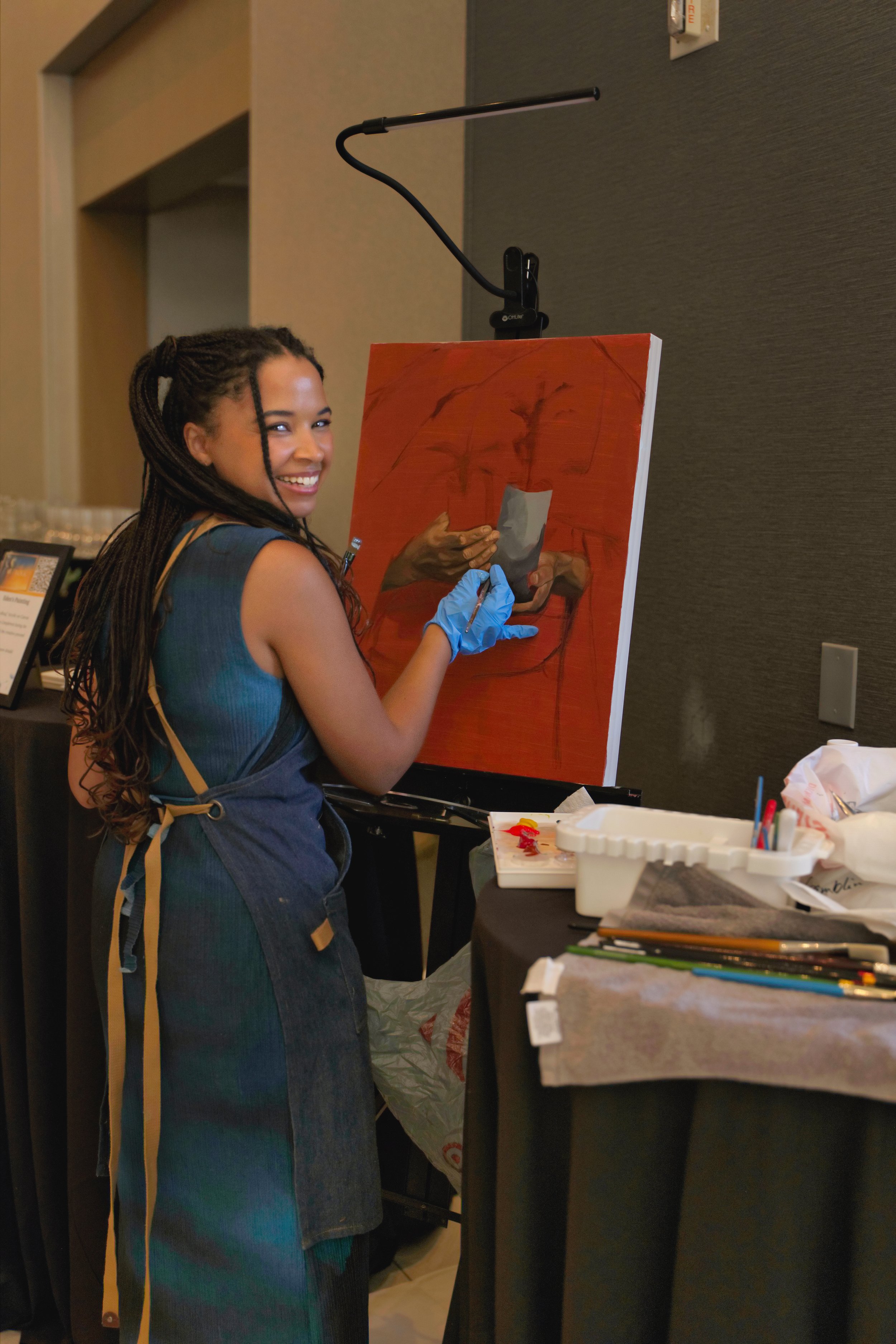
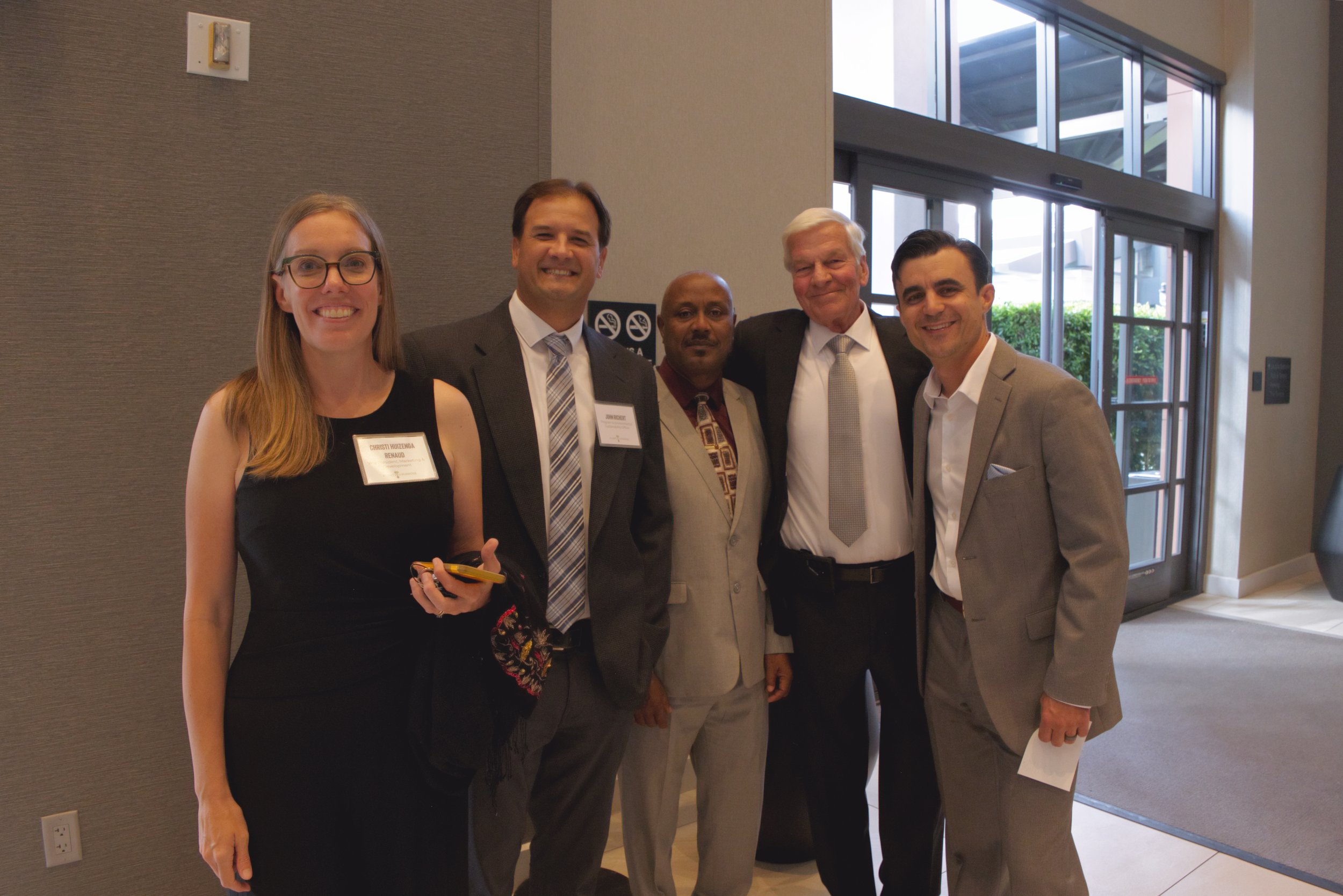
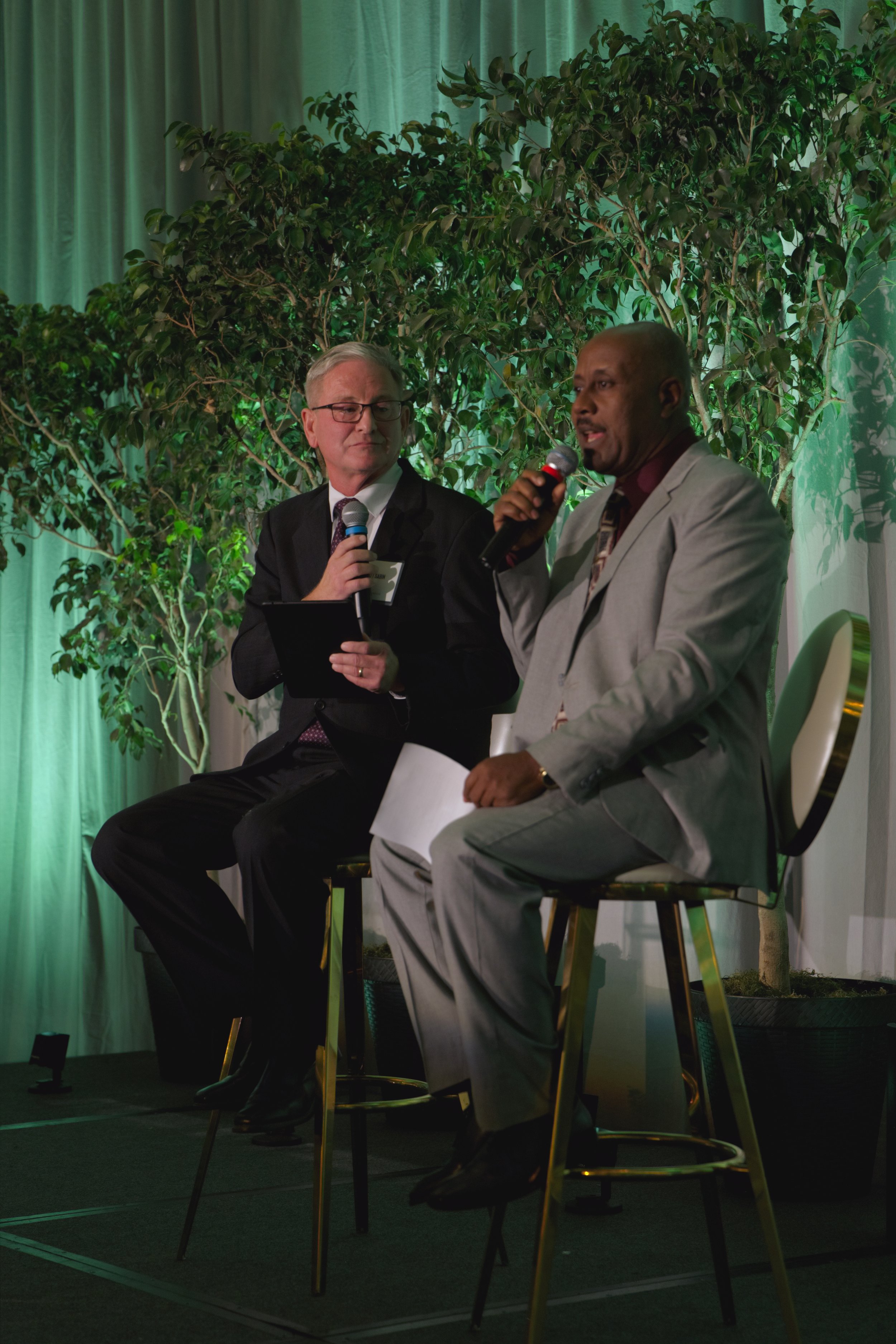
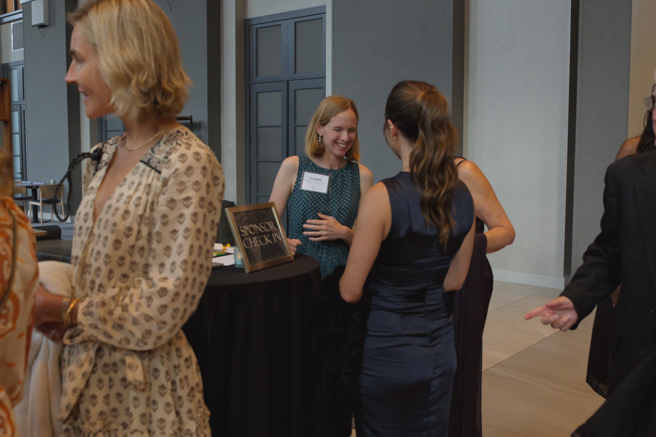
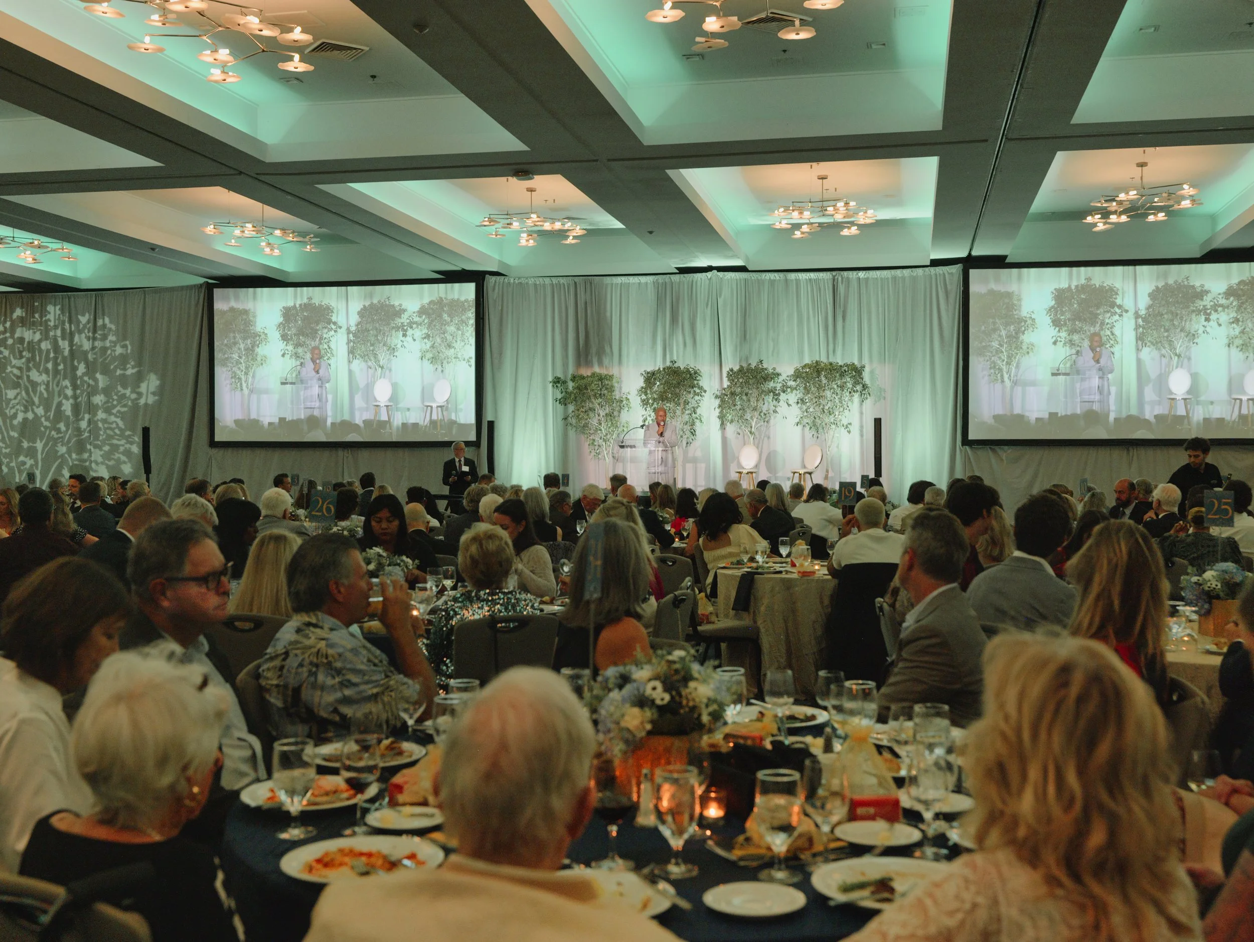
Event photography for the nonprofit organization Plant With Purpose focused on capturing the atmosphere, community, and mission behind a fundraising gala designed to raise support and awareness. The event included both indoor and outdoor environments, requiring adaptability with varying lighting conditions while maintaining a cohesive and polished visual style throughout the evening. Photography centered on documenting meaningful interactions, keynote moments, donor engagement, and the overall experience in a way that reflected the organization’s purpose and impact.

The final imagery was created for use across newsletters, social media, promotional materials, and personal keepsakes for attendees and organizers. By combining candid storytelling with intentional event coverage, the photography helped preserve the energy and significance of the gala while creating versatile visual content that supports future outreach, engagement, and nonprofit storytelling.
First Light Surf Club Film Release
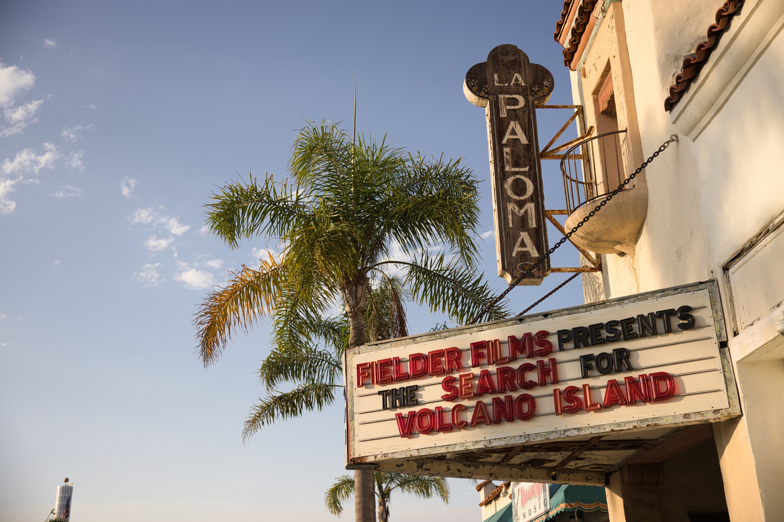
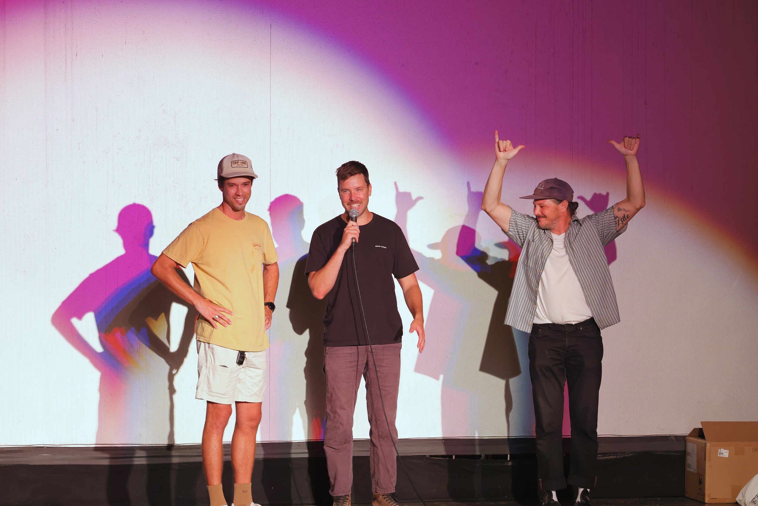
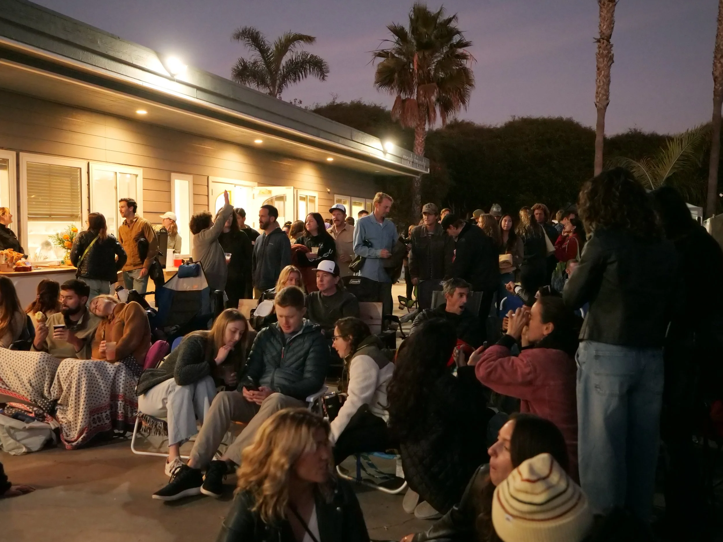
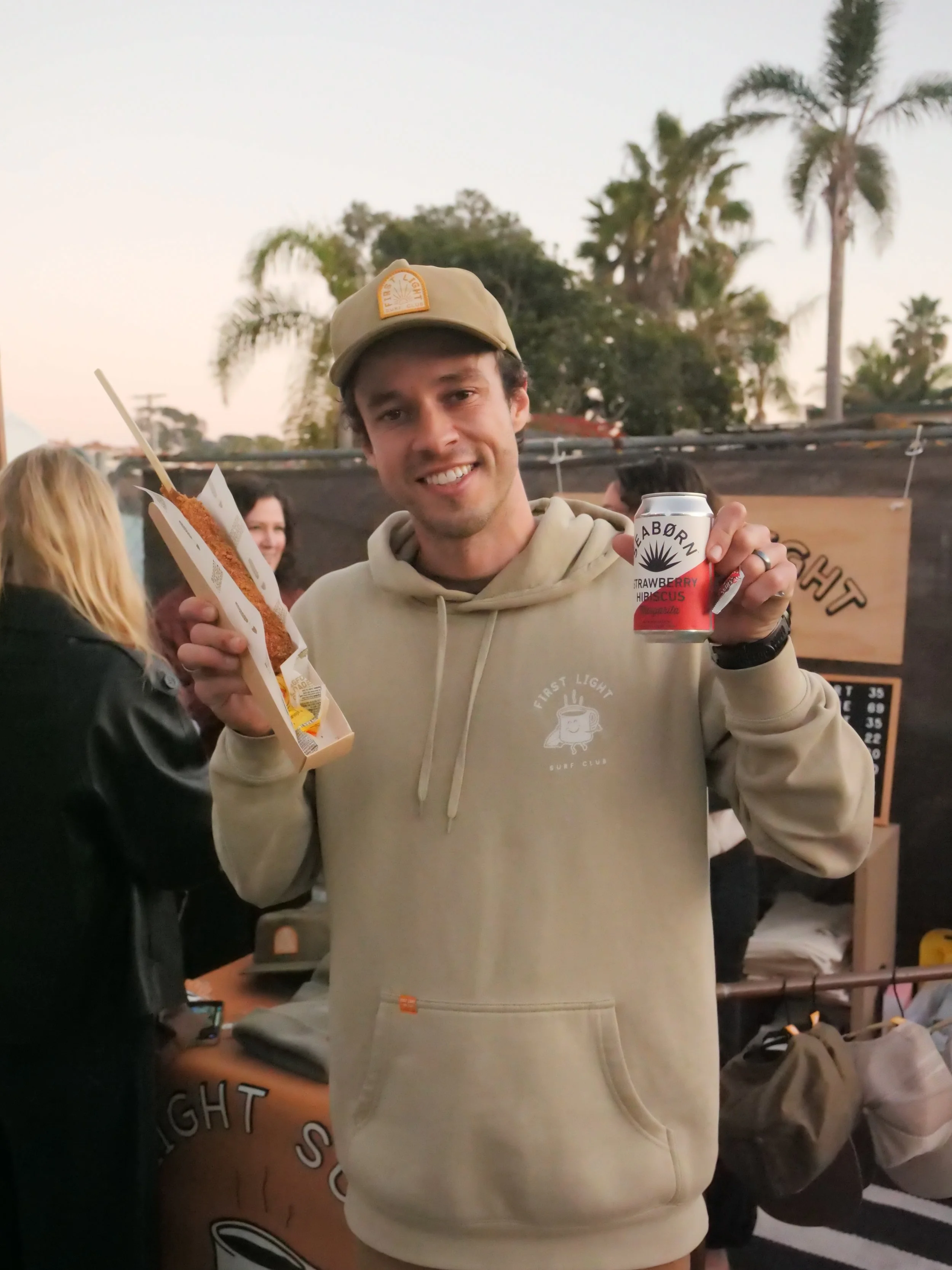
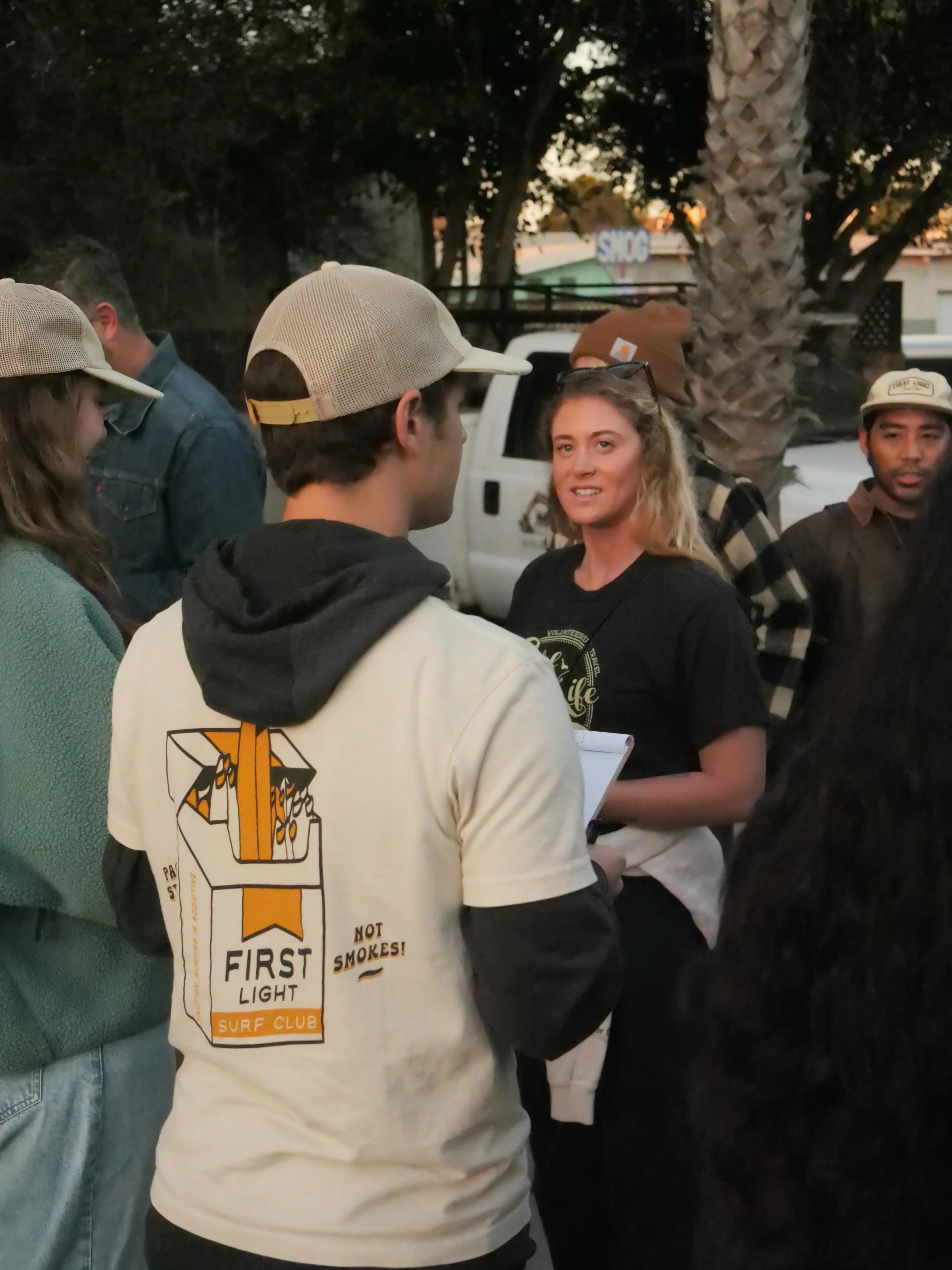
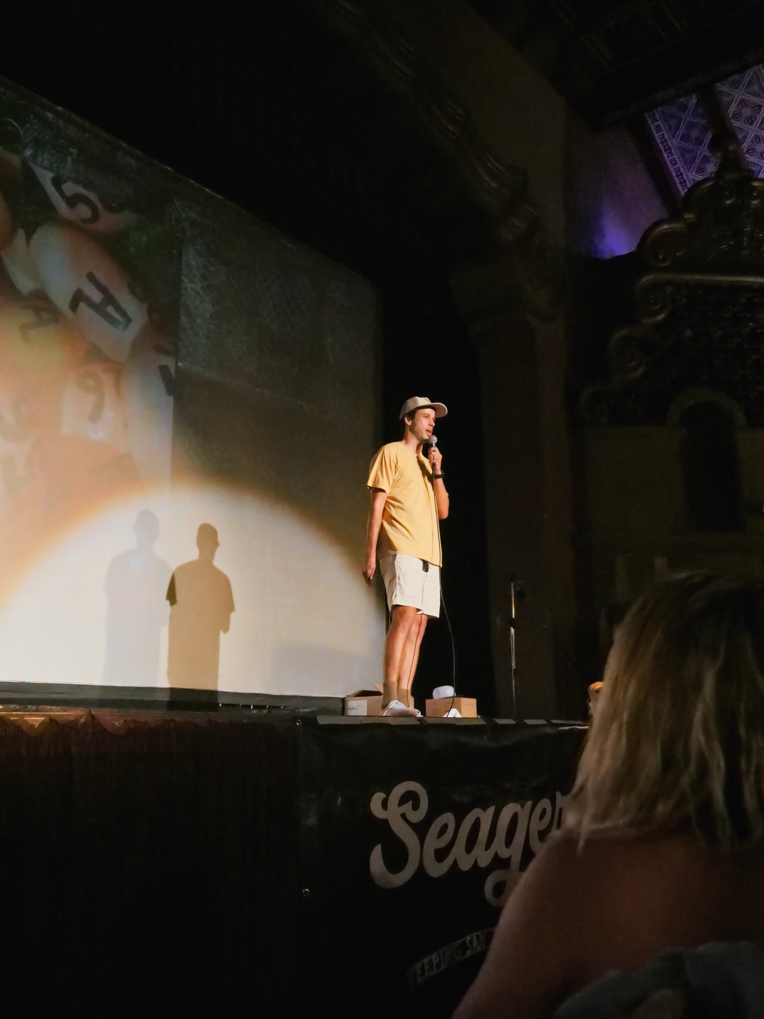
This event photography project was for a surf club focused on documenting the energy and community surrounding the premiere of newly released surf films. The event took place across both a theater setting and outdoor gathering spaces, requiring coverage in varying environments while maintaining a cohesive visual style that reflected the excitement and culture of the surf community. Content was centered around capturing authentic interactions, crowd atmosphere, featured films, and the overall experience in a way that felt dynamic, immersive, and socially engaging.

Created primarily for social media and digital promotion, the final content also highlighted the multiple brands supporting and sponsoring the event through intentional footage and branded moments woven naturally into the environment. By combining candid storytelling, event coverage, and lifestyle-driven visuals, the project delivered engaging media that showcased both the collaborative nature of the event and the fun, welcoming atmosphere surrounding surf culture.