PRINT DESIGN
Print materials crafted with detail, clarity, and creativity
Mission Ave Bar & Grill
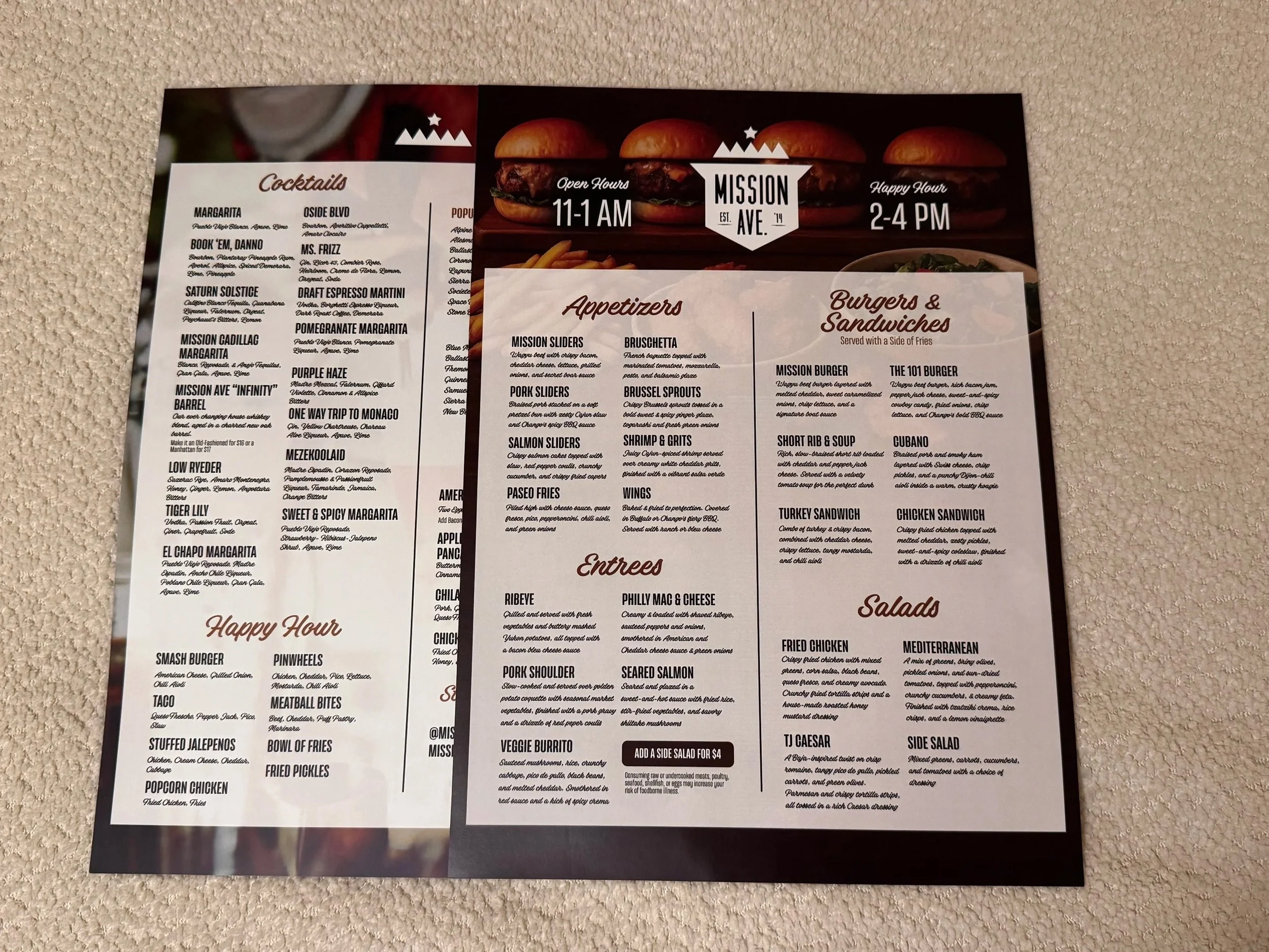

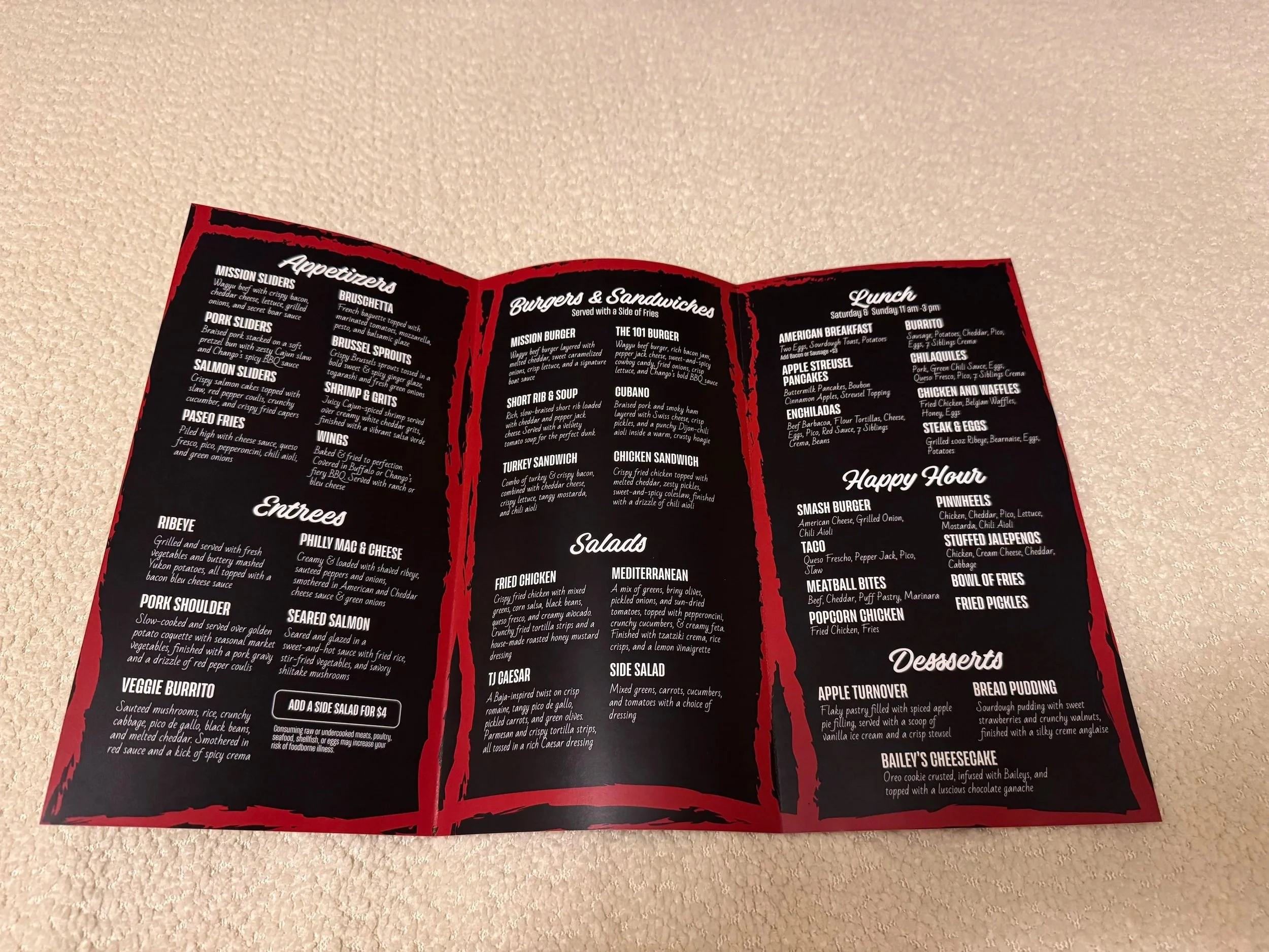
The existing menu system separated food and drink into different 8.5x11 sheets printed on low-quality paper, creating a disjointed experience that did not reflect the quality of the restaurant’s offerings. This project aimed to elevate the brand through a redesigned menu system that better aligns with the dining experience and serves as a starting point for a broader marketing strategy. The goal was to create a more cohesive, intentional presentation that matches the standard of the food itself.

Three menu directions were developed to give the client flexibility: a version with imagery, a minimal version using texture without imagery, and a tri-fold option for a more structured layout system. Each approach explored hierarchy, readability, and visual identity while improving usability. The final concepts also introduced larger-format, waterproof material to enhance durability and address previous quality issues, reinforcing a more elevated and consistent brand experience.
Wild and Wholesome
For Wild and Wholesome, I developed a fully designed brand book that consolidates strategic direction and visual identity into a single cohesive document. The intent was to move beyond a standard presentation format and instead create an immersive, visually engaging experience that could guide design discussions and decision-making more effectively.

The book outlines core brand elements including logo direction, packaging systems, and marketing strategies, all structured through intentional layouts and refined visual design. By combining written rationale with fully designed pages, the document serves as both a strategic guide and a presentation tool, making the brand direction clearer, more compelling, and more engaging for design meetings.
Zach Bryan Poster
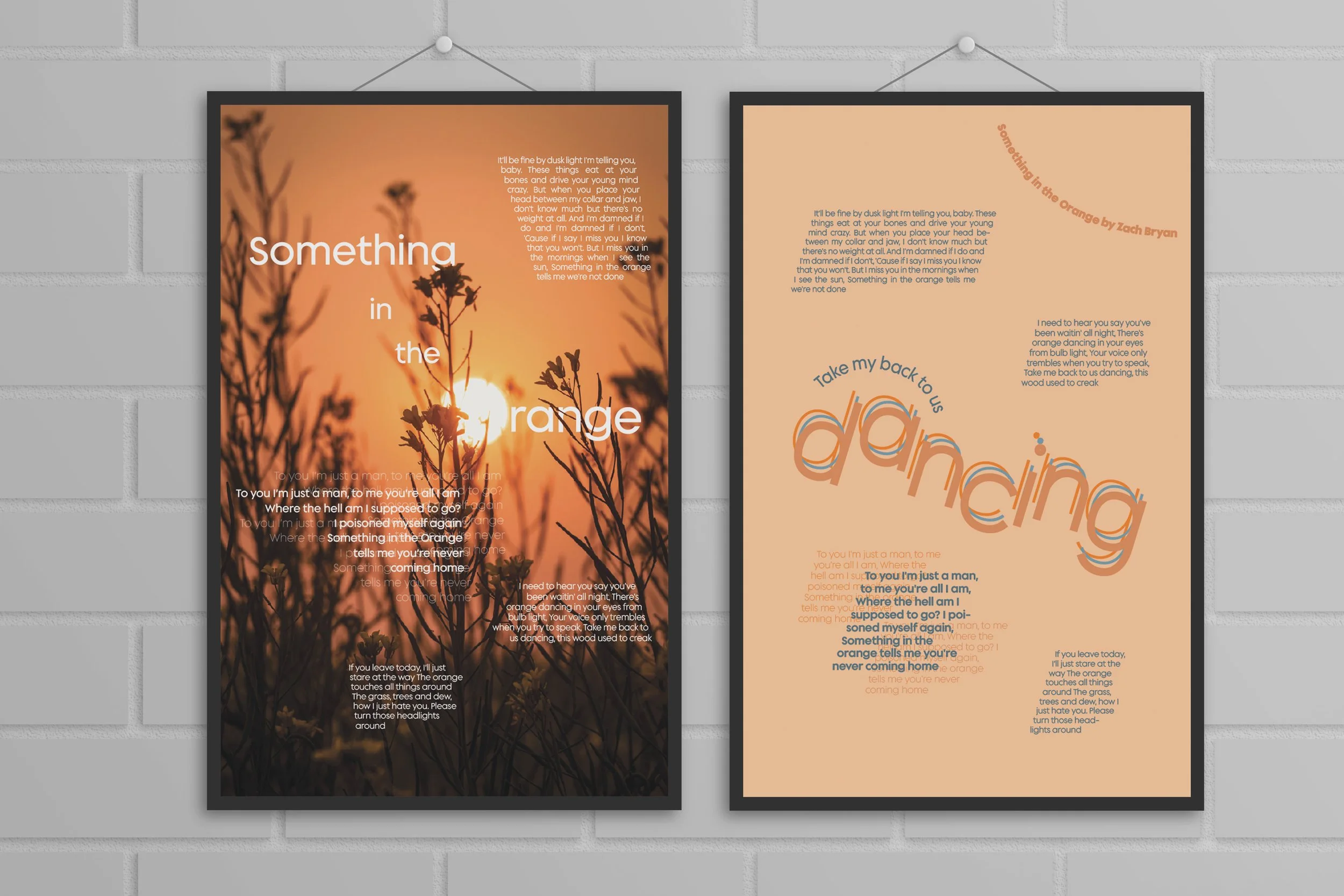
Conveying complex emotion and narrative through typography can be difficult, as traditional layouts often don’t fully capture the meaning within song lyrics. This project explored logotype and postmodern grid systems through word association and experimentation to create a more expressive typographic response, using type, imagery, and photography to evoke the feeling of being carried by music. A motion-driven font and varied grid structures were used to refine hierarchy and composition, with the logotype centered and the artist name and song title curved to enhance flow.

Imagery was selected to reflect the warm orange palette and emotional tone of the song, including wind-swept plants and silhouetted sunsets to reinforce movement and atmosphere. These visuals informed the final postmodern layout, unifying typography and image to capture the essence of Something in the Orange through warmth, motion, and cohesive design.
Game Changer Publishing
This project involved redesigning the interior pages of a planner intended for a mature, higher-end audience. While the author liked the prior direction, she felt it leaned too heavily toward a teenage demographic rather than the middle-aged women she envisioned as her target market. Through collaborative meetings, I identified the elements she wanted to keep while refining the design to feel more sophisticated, timeless, and approachable.

A large part of the process focused on typography exploration, reviewing numerous typefaces until we found one she loved, jokingly saying, “If I could marry a font, it would be this one.” Working within the constraint of black-and-white printing for cost-effectiveness, I used thoughtful typography, spacing, and subtle decorative elements throughout the planner to create a more feminine and elevated feel while also helping guide the reader through the content. The result was a polished design that reflected both the client’s vision and the needs of her audience
Social Issue Poster

Environmental degradation remains a critical issue, as human activity continues to significantly impact nature and future generations. This project aimed to promote environmental responsibility through a poster and GIF, using a custom-designed symbol to communicate preservation and human impact. Two hands were used as the central icon to represent responsibility, with emphasis on hierarchy, scale, and clarity to strengthen the visual message.

The design process involved refining color palettes and simplifying the form, ultimately leading to a more cohesive, texture-free symbol with a rounded base. The poster was then built around this icon, adjusting information and contrast for better legibility, with varying shades of green used to enhance clarity. A complementary GIF was created in Adobe Photoshop, showing branches growing from the hands to illustrate environmental impact while adhering to a three-color palette and reinforcing the theme of sustainability and stewardship.