
PACKAGING DESIGN
Bold packaging concepts built to stand out on the shelf
Wild and Wholesome Treats
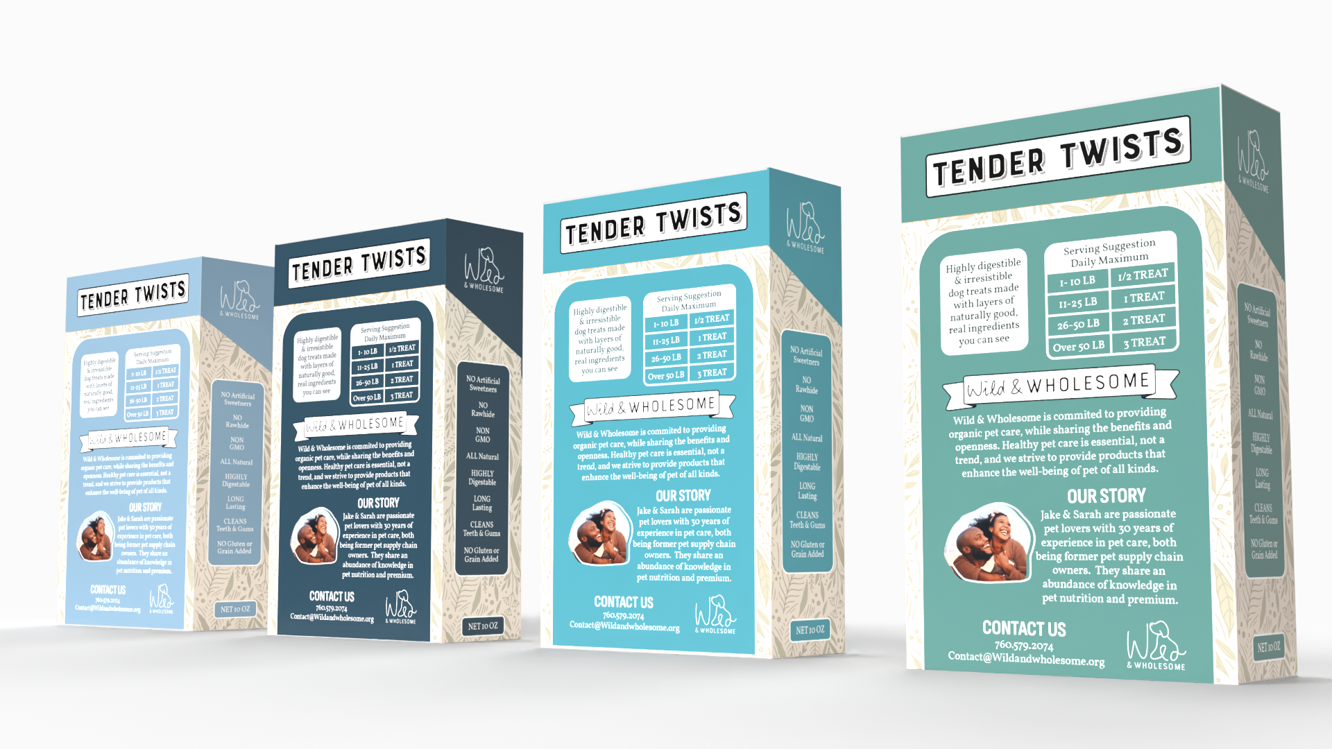
Researching competitor packaging played a major role in developing the Tender Twist dog treat packaging, particularly when exploring how bold visuals and key information are presented within pet product and specialty packaging industries. Inspiration was drawn from the structured hierarchy and recognizable layout style of Marlboro packaging, as well as the informational tags commonly used in marijuana and CBD packaging to quickly communicate important product details. Early stages focused heavily on sketching layouts, experimenting with die-cut placement, hierarchy, and branding elements before introducing color or imagery. Throughout the process, careful consideration was given to spacing, legibility, and composition to ensure the packaging remained visually engaging, cohesive, and functional for both branding and print production.
Wild and Wholesome Shampoo

To expand the Tender Twist product line, additional shampoo packaging was designed while maintaining a cohesive and recognizable brand identity across all products. Consistency was created through the continued use of the established color palette, typography, logo placement, and overall visual style, allowing each product to feel connected while still differentiating product types and scents. Special attention was given to hierarchy and packaging structure to ensure the shampoo design translated naturally alongside the dog treat packaging, creating a unified and professional product family. By balancing consistency with product-specific details, the packaging system strengthened brand recognition and created a cohesive shelf presence across multiple forms of pet care products.
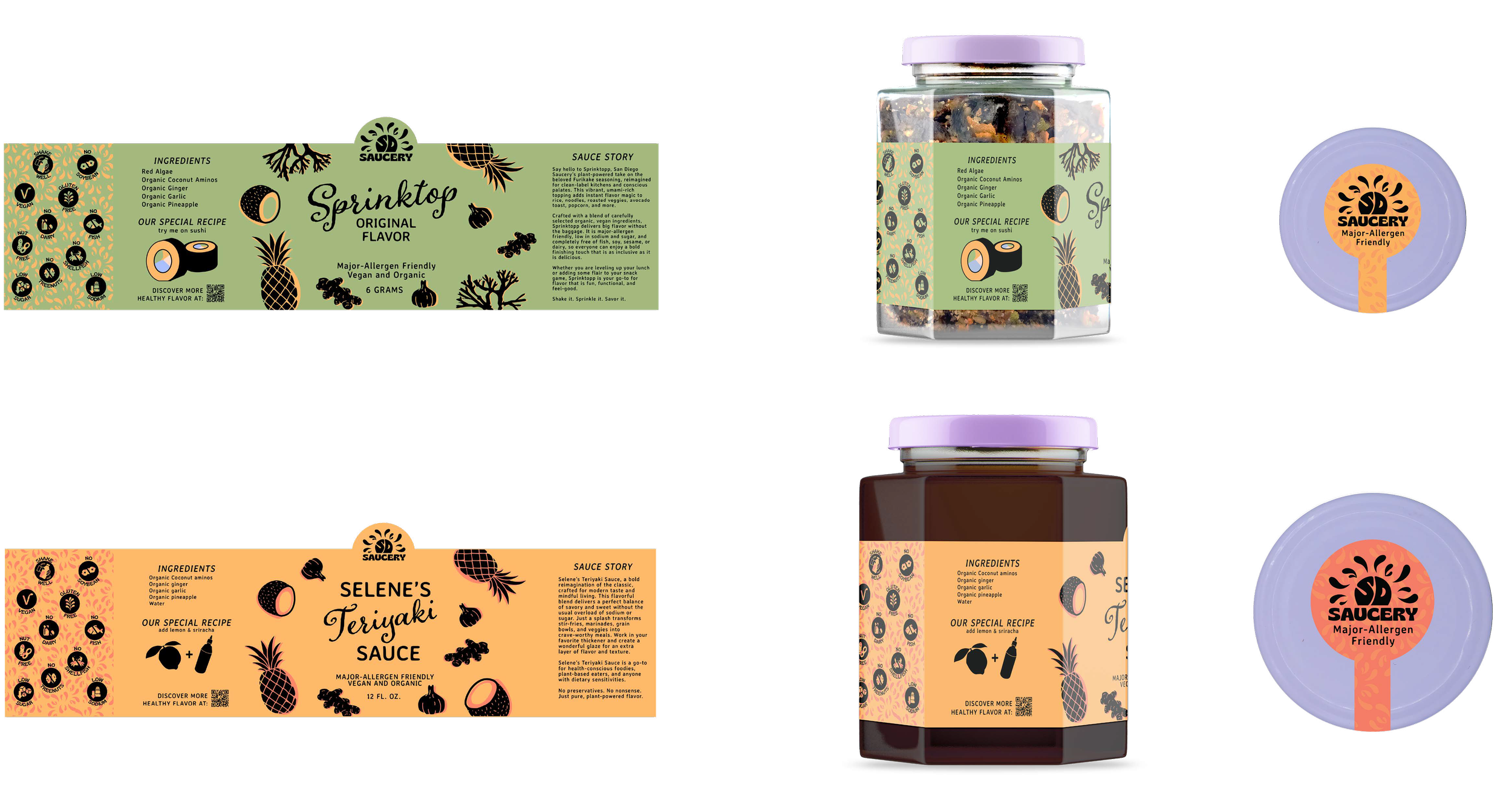
The packaging was designed to highlight the variety of sauces and sprinkle toppings while maintaining a cohesive system across all products. Custom illustrated ingredient graphics were created in a playful style inspired by the energetic character of San Diego, reinforcing the brand’s personality and visual identity. A repeating wraparound pattern helps break up text, emphasize key icons, and communicate product benefits in a clear, engaging way. The label system is divided into three design-focused panels and three informational panels, balancing visual appeal with essential product details and brand story. Because the products are intended for farmers markets, key attributes such as vegan, organic, and major allergen-friendly are prioritized on the front for quick readability. Overall, the packaging communicates a playful yet elevated brand experience that feels personal, thoughtful, and distinct in a crowded market.
San Diego Saucery
The Howell Wine
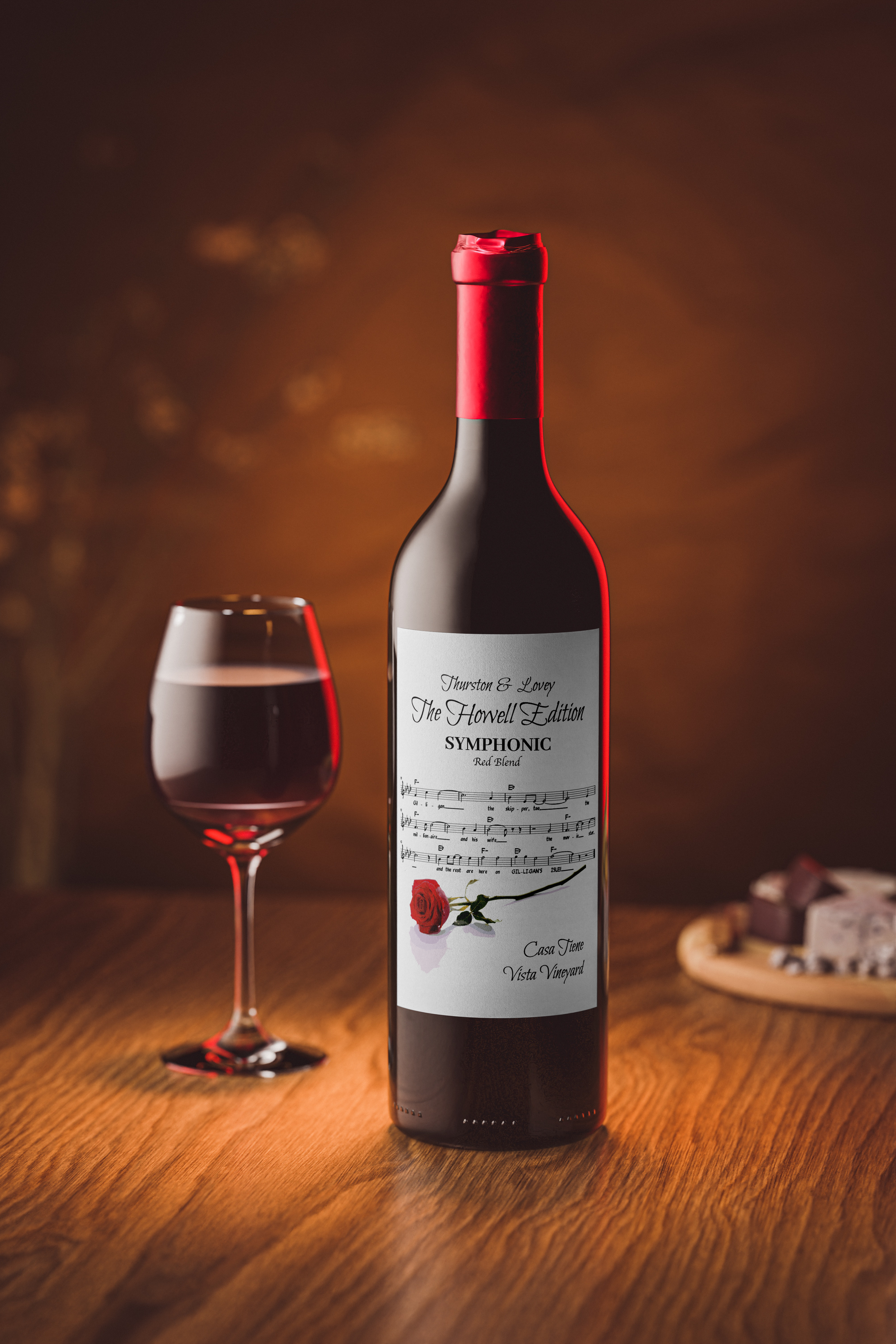
This wine bottle label was designed within a set of established brand guidelines to ensure consistency with previous labels in the collection, including visual references tied to a specific song theme. While maintaining the recognizable style and structure of the existing series, the design was refined through quality enhancements, thoughtful stylistic decisions, and personalized visual details that elevated the overall presentation. Careful attention was given to typography, imagery, composition, and texture to create a label that felt cohesive with the brand while still bringing a unique and customized artistic approach to the final design.