MUSIC BROADSIDE
Effectively conveying complex emotions and narratives through typography and design can be challenging. Traditional layouts may not fully capture the depth of meaning within a song’s lyrics, requiring a more experimental approach to visual communication.
PROBLEM:
This project explored logotype and postmodern grid techniques through thought mapping and word association to create a compelling typographic representation. The posters used imagery and typography to convey emotion and narratives through type placement and photography.
SOLUTION:


BEGINNING STAGES
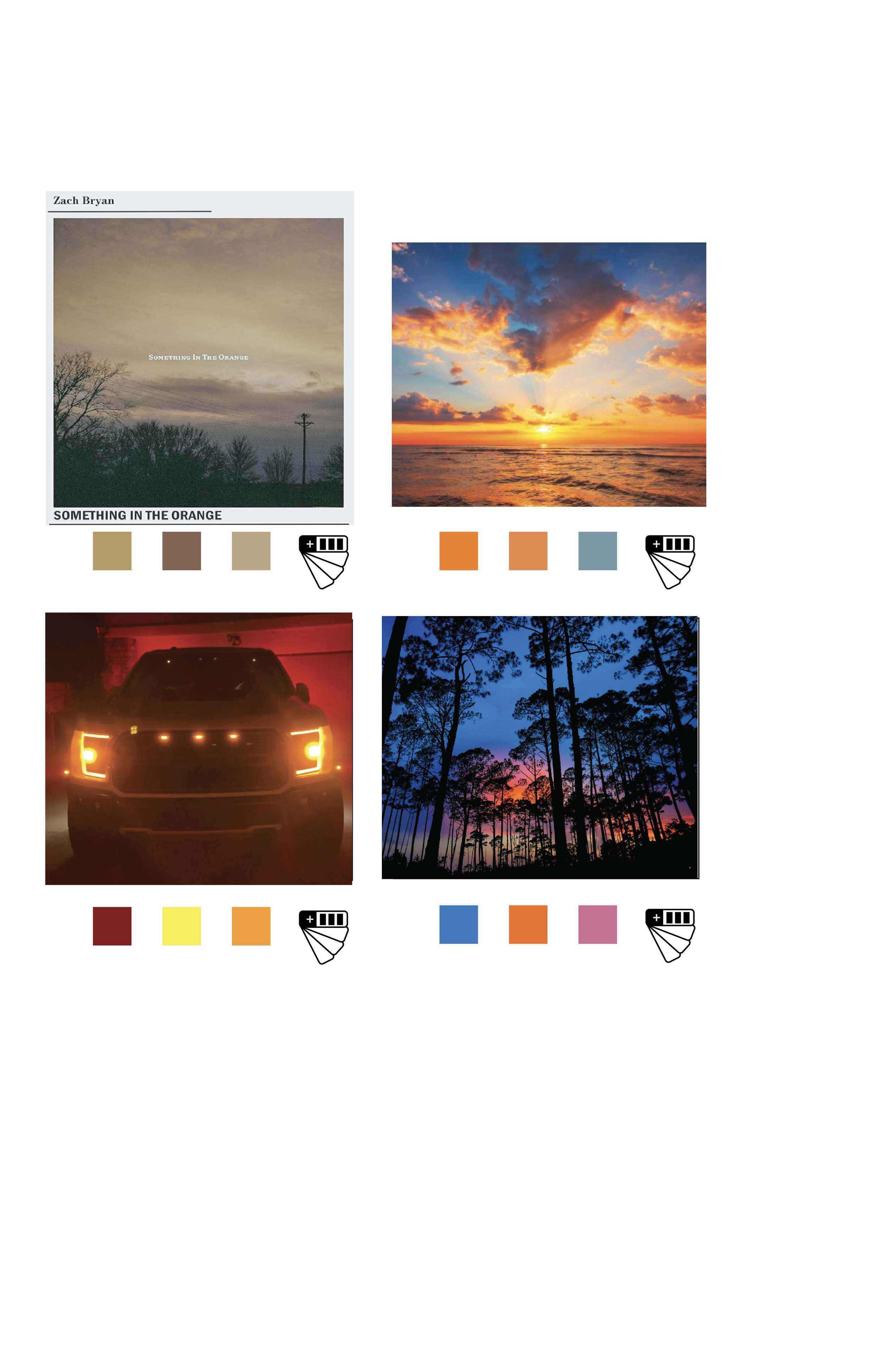
The intent was to visually capture the feeling of being carried away by the music. This font was chosen for its ability to convey movement within the type. Various imagery was explored to find the most effective essence of Something in the Orange.

SOMETHING IN THE ORANGE
〰️
SOMETHING IN THE ORANGE 〰️
PROG
RESS
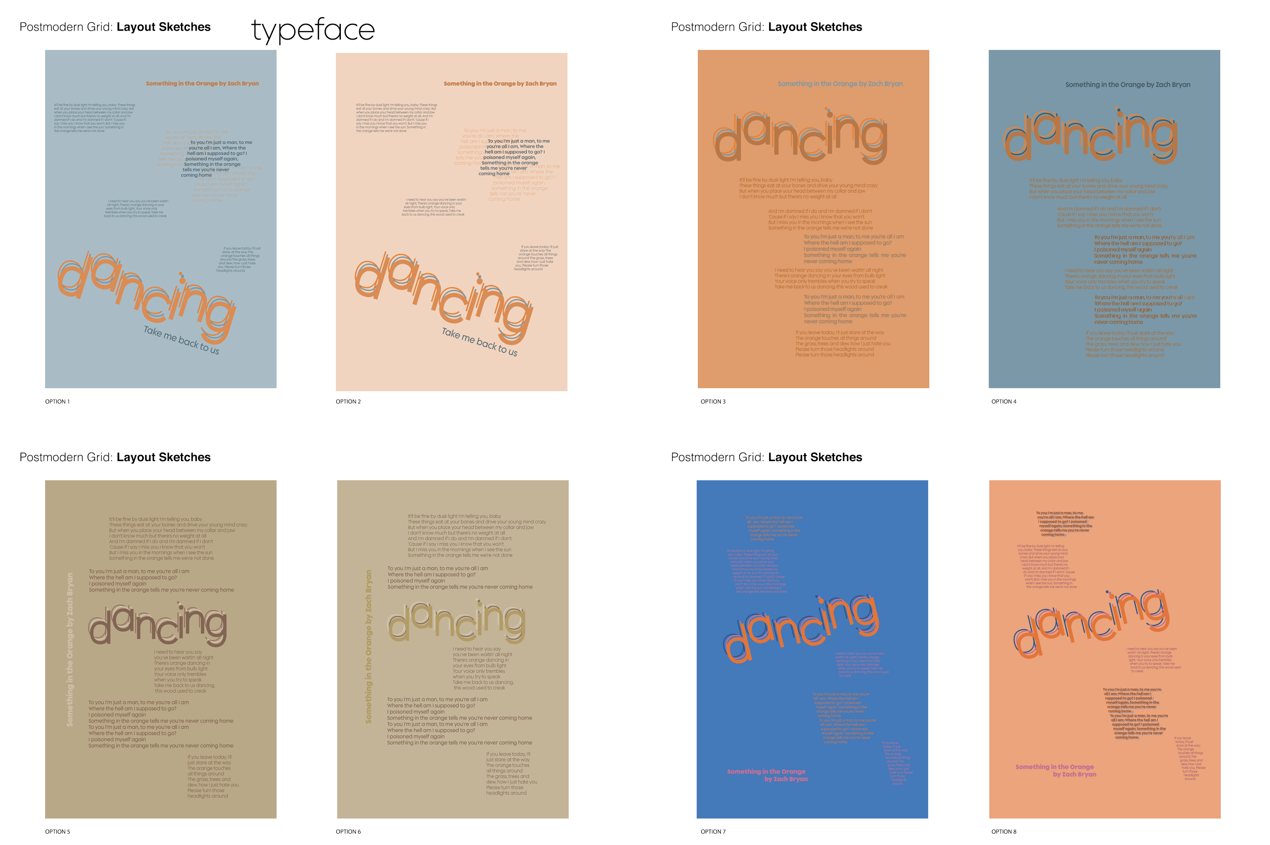
Various grid structures were explored to enhance hierarchy and optimize space, with the primary logotype positioned at the center. The artist’s name and song title were strategically placed along a curve to accentuate the design and create a cohesive visual composition.
When selecting an image to complement the logotype poster, the goal was to capture the orange theme central to the song. To reinforce the concept of dancing, imagery such as wind-swept plants and silhouetted sunsets were considered. These visuals were then used to construct postmodern grids, ensuring that the typography harmonized with the selected image. The final layout, which was the most compelling, successfully conveys themes of movement, warmth, and the rich hues of an orange sunset.


CONNECT
WITH ME

