EVENT BRANDING
Branding events through immersive and intentional design
Wander
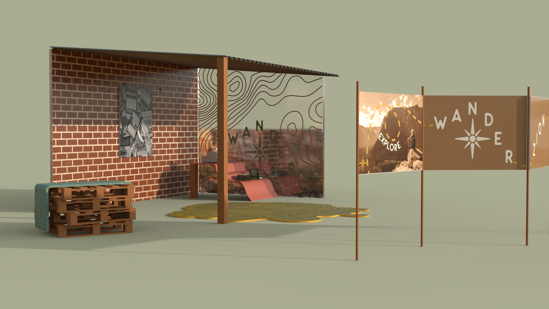
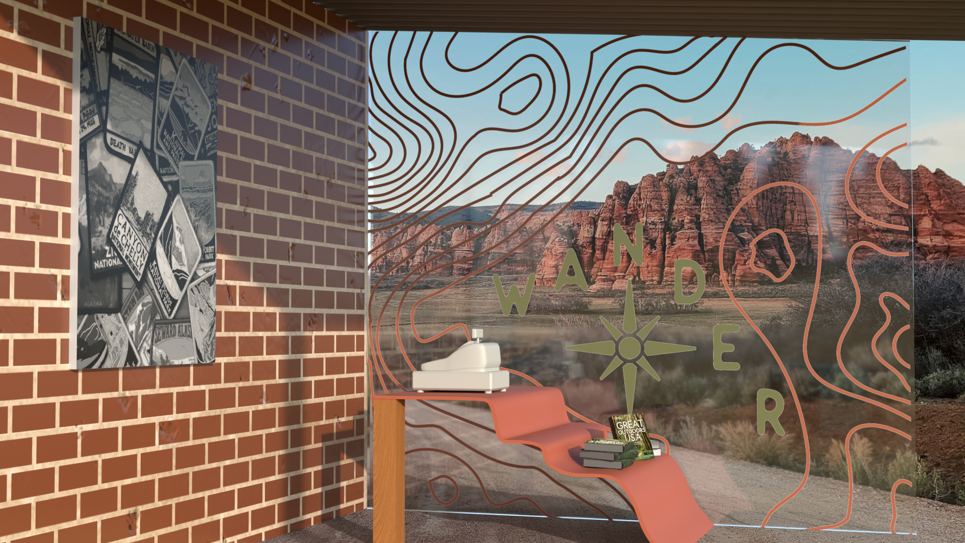
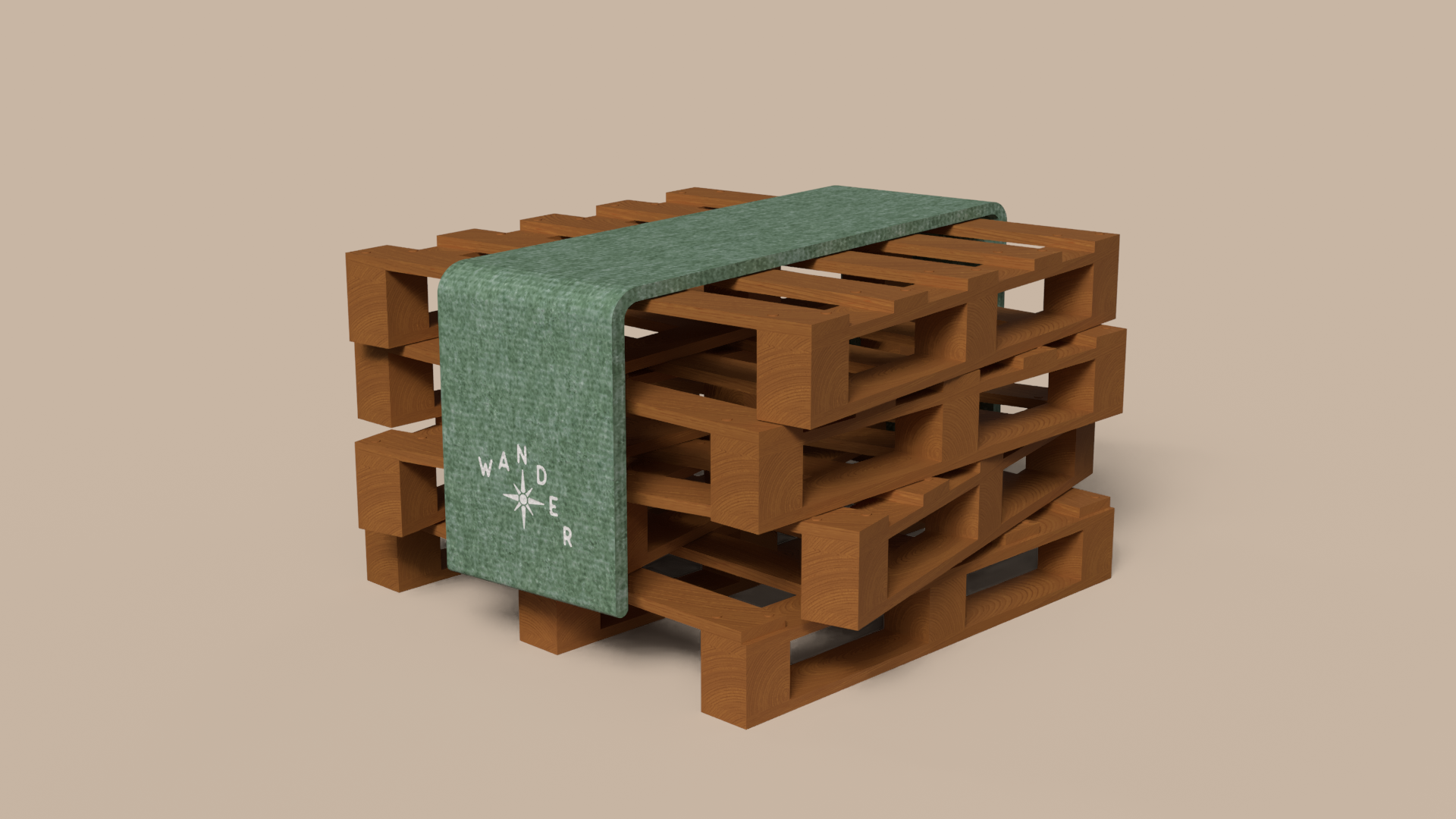
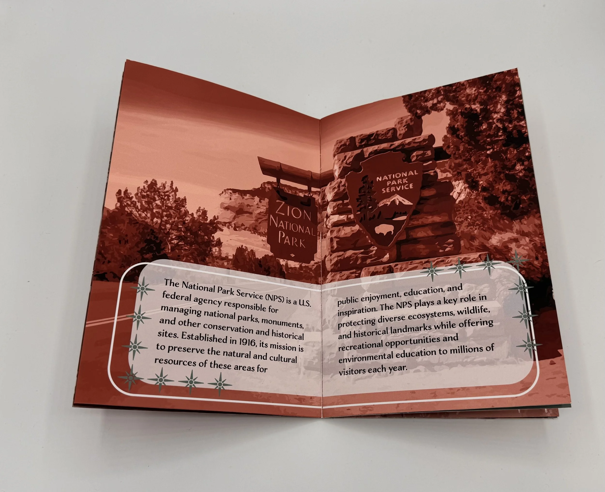
This environmental branding project focused on creating a cohesive visual identity system that could function across both physical spaces and promotional materials. A major part of the process involved learning and utilizing Adobe Dimension to create realistic 3D environmental mockups that showcased how the branding would exist within a real-world setting. Through experimenting with lighting, materials, perspectives, and spatial placement, the environments helped visualize the experience of interacting with the brand beyond flat designs alone.

The project also included the development of environmental graphics such as wayfinding systems, promotional banners, and branded flats that worked together as a unified experience. Attention was placed on hierarchy, readability, and consistency to ensure the branding remained recognizable across multiple scales and applications. Designing within environmental spaces required balancing functionality with aesthetics so that each piece not only guided viewers effectively, but also reinforced the overall visual identity.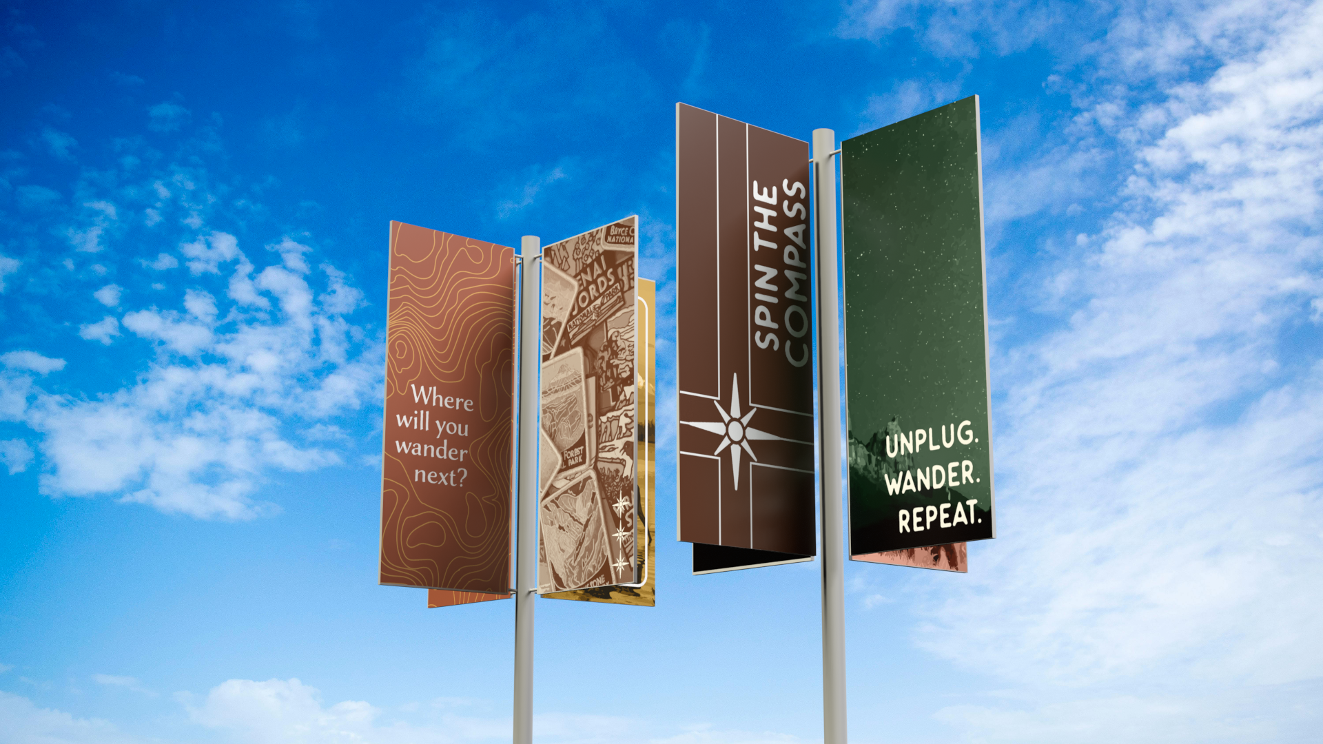
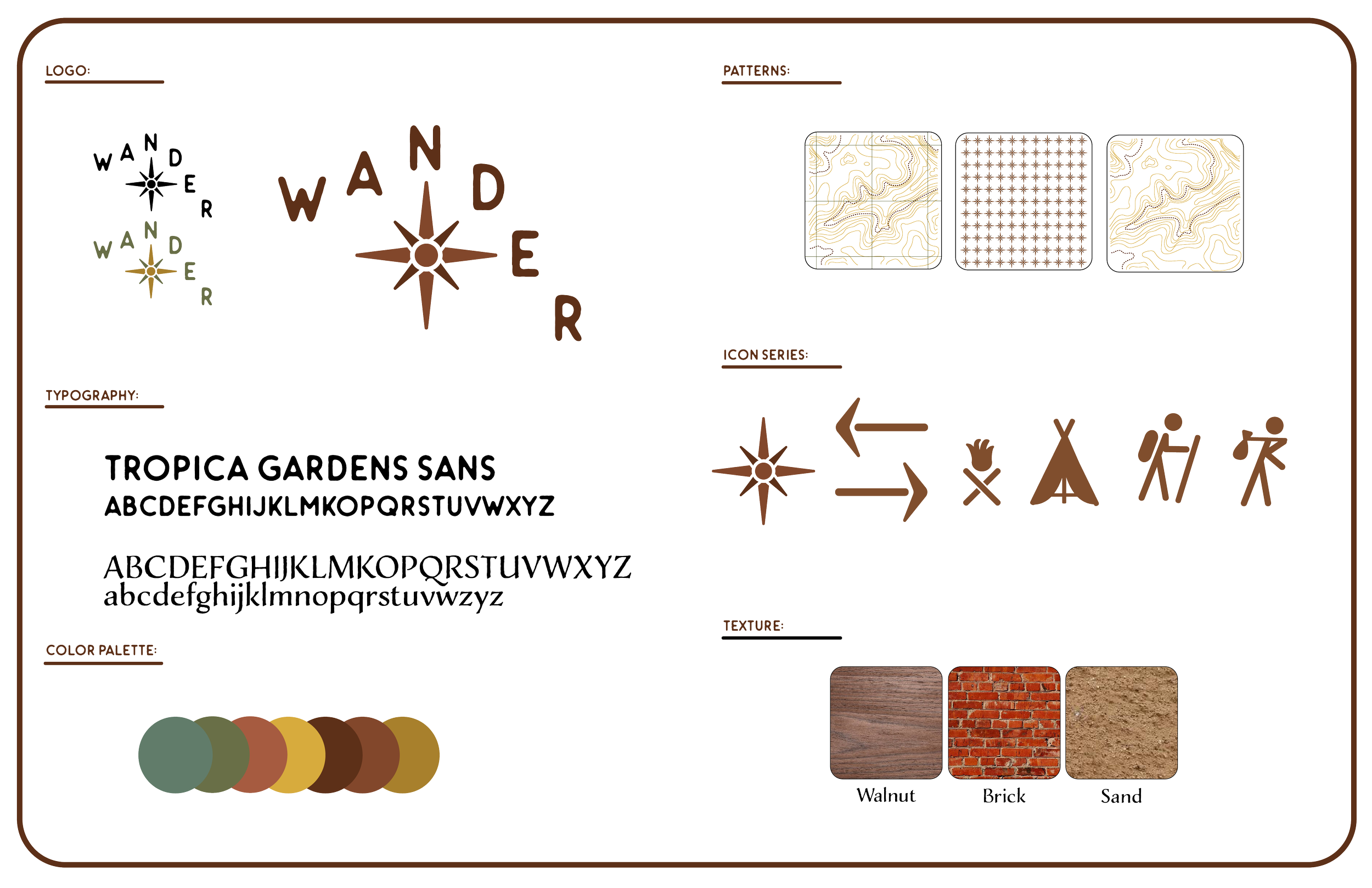
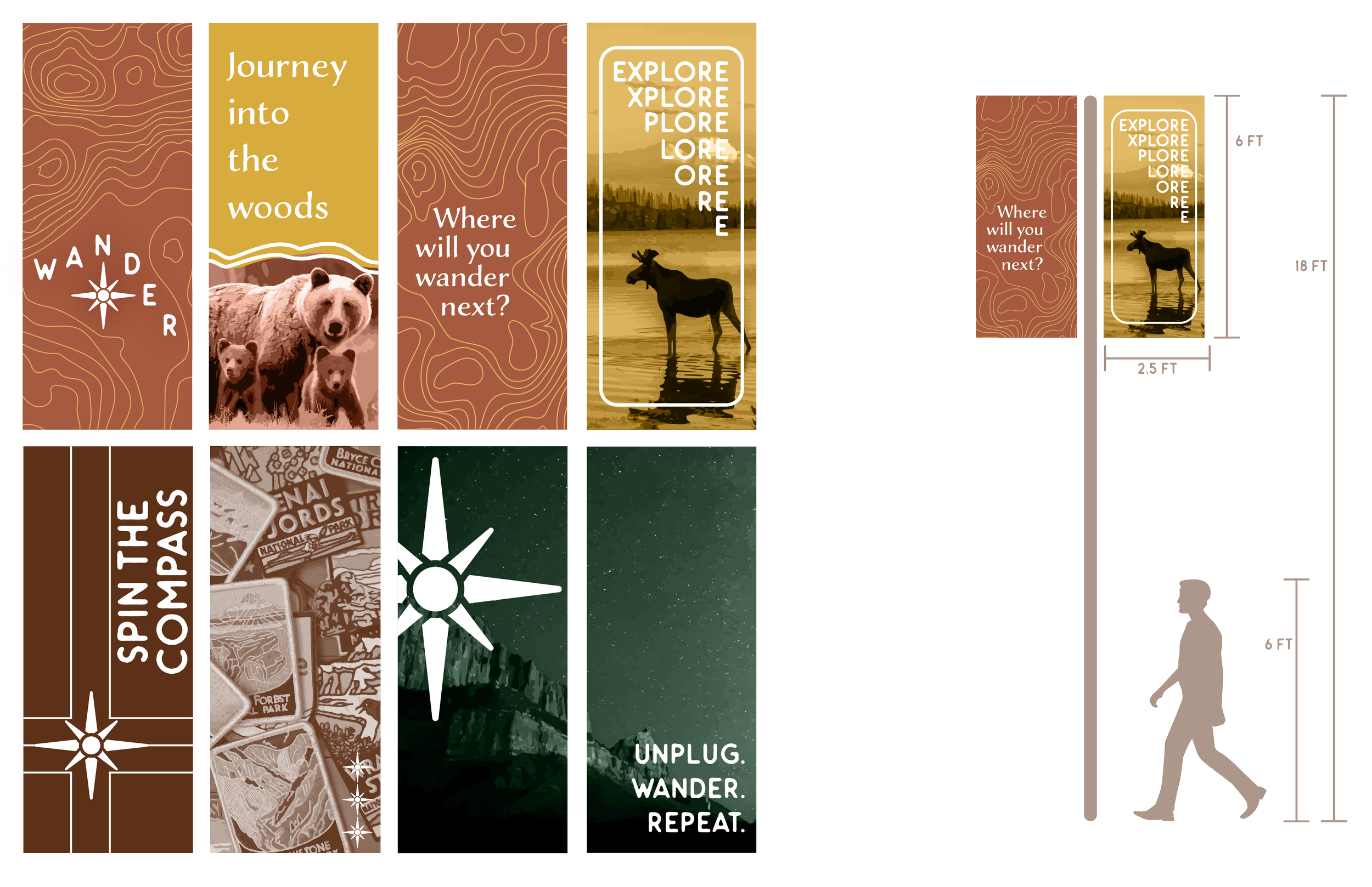
To maintain consistency throughout every application, a detailed brand guidelines packet was created outlining typography, color palettes, logo usage, layouts, and supporting graphic elements. The goal was to ensure that every environmental and promotional piece felt connected while clearly communicating the brand’s personality and direction. Developing the guidelines strengthened the overall system and established rules that could be carried across future materials and spaces.
The logo design centered around the idea of navigation and movement by incorporating a compass-inspired symbol into the visual identity. Two of the letterforms were intentionally integrated to represent the directional markers “N” and “E,” reinforcing the theme of guidance and exploration throughout the branding system. This concept carried into the environmental graphics and wayfinding elements, helping unify the visual language while creating a recognizable and meaningful identity across the entire project.
SDSU Open Studios


DEVELOPMENT


This branding campaign for SDSU’s PSFA Open Studios began with exploring themes connected to SDSU, the School of Art and Design, architecture, and artistic growth. The concept of students being “in bloom” became the foundation of the project, symbolizing creative development while also representing the diverse mediums showcased throughout the event. A custom photoshoot was conducted featuring artistic tools paired with flowers in a variety of compositions and environments, allowing for experimentation with perspective, layout, and visual storytelling. Additional illustrated elements were incorporated to further emphasize the tools and connect the imagery back to artistic practice.

The final visual system was carried across the poster, directional wayfinding signage, and postcard design to create a cohesive event identity. After refining the strongest poster composition, the design expanded into signage that guided visitors through the event while maintaining visual consistency. Supporting promotional materials, including the postcard, were designed to balance visual engagement with informational clarity through thoughtful typography, composition, and color choices.
Plant With Purpose

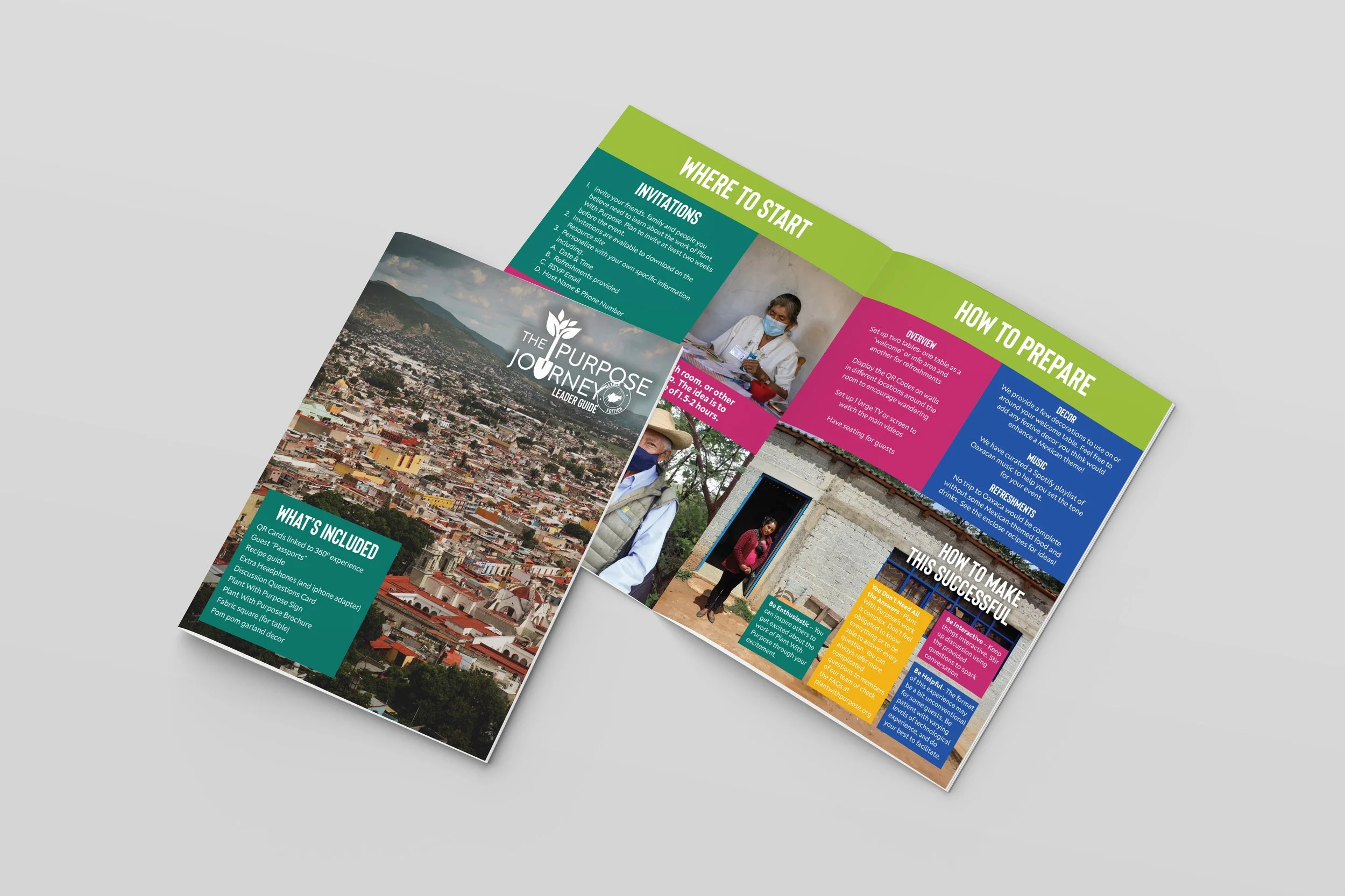


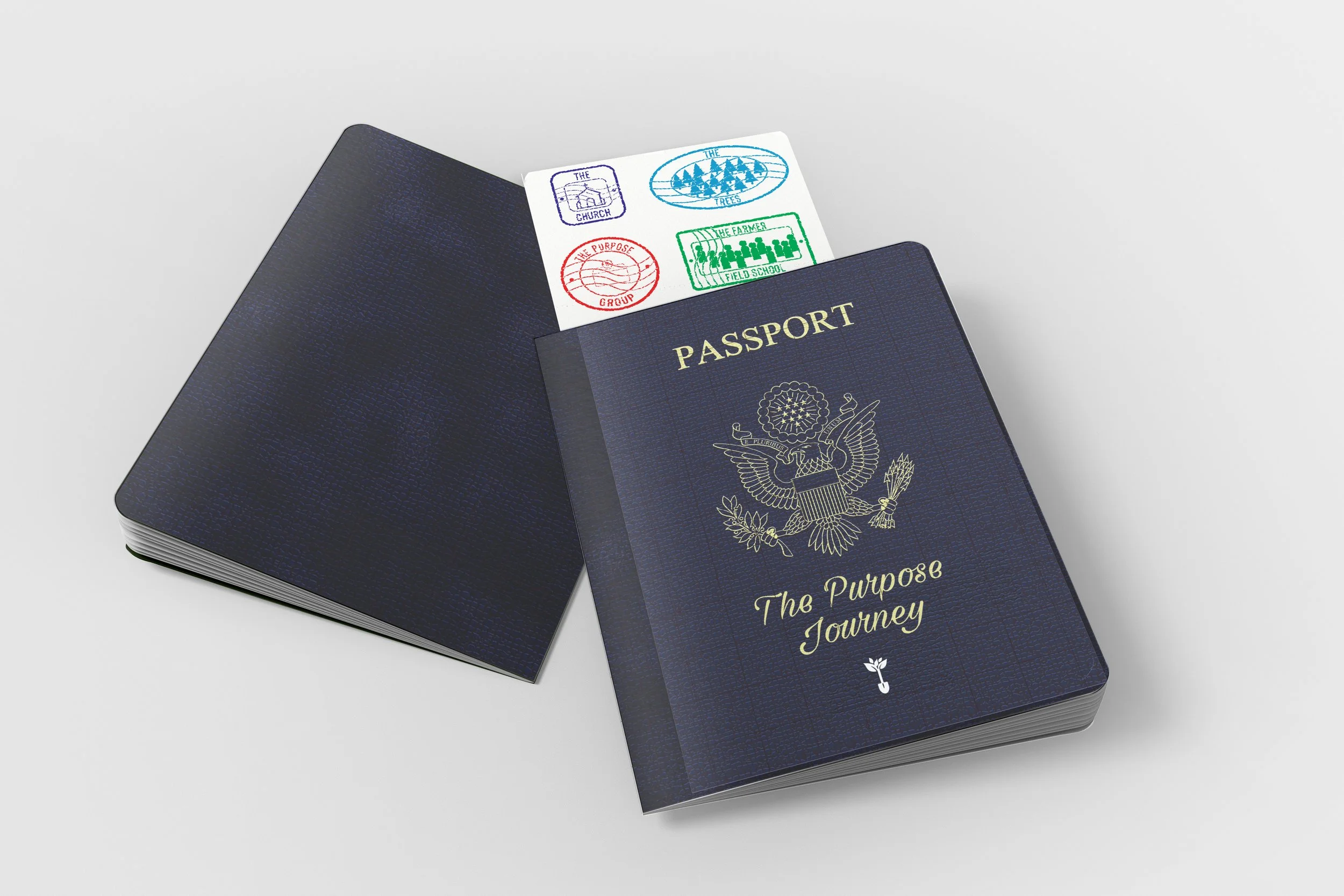
This project for Plant With Purpose focused on creating an interactive Virtual Vision Trip that helped supporters better understand the nonprofit’s mission of combating poverty, supporting reforestation, and fostering spiritual renewal through locally led initiatives. Designed as an immersive board game experience, the project combined culturally inspired visuals, local photography, and branding elements influenced by Oaxaca while maintaining cohesion with the organization’s existing identity through the use of the recognizable shovel icon and stamp-inspired graphics.

Supporting materials were created to enhance engagement throughout the experience, including passports with collectible stamps, a leader guide with QR-linked interactive content, a recipe booklet, and a Spotify playlist card. Together, these materials created a cohesive and immersive system designed to educate participants while strengthening their connection to the organization’s mission and the culture of Oaxaca.